Table Elements
Learn what Table Elements are, how they display data in your Live App, and how to configure and customize them using Knack's builder.
What You'll Learn
Table Elements display records from your data in a structured, row-and-column format in the Live App. This article covers what Table Elements are, how to access them, and where to go to configure them.
What are Table Elements?
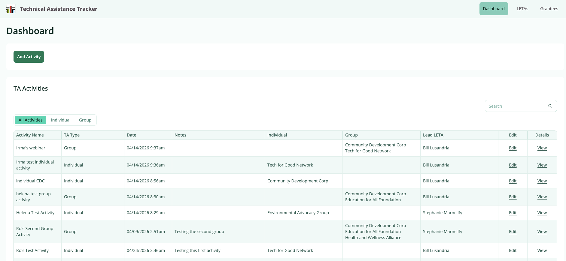
A Table Element displays multiple records from a table as rows, with each column representing a field. Tables are one of the most common elements in a Knack app — they let users view, search, filter, sort, and interact with your data from a single page.
Tables can also include action columns that let users edit records, view details, delete records, or trigger other actions directly from the Table.
What Table Elements Look Like in the Live App
In the Live App, each row in a Table represents one record. Each column represents a field from your data table. Depending on how you configure the Table, users may also see controls for search, filtering, export, and pagination above or below the Table.
Accessing Table Elements
Table Elements live inside pages in your app. To find or add a Table Element:
- Go to the Pages section of the Builder
- Select the page that contains your Table, or add a new page
- Select the Table Element in the center panel to open its settings on the right
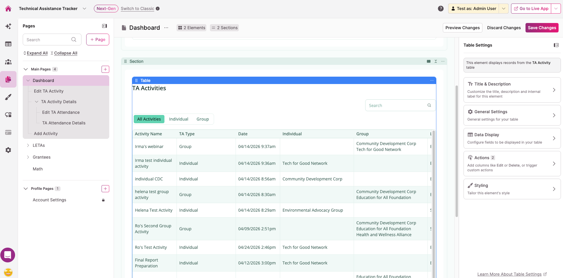
Configuring a Table Element
When you select a Table Element, the settings panel opens on the right with five sections:
- Title & Description — Set the element title, description, and internal label
- General Settings — Control user options (inline editing, column resizing, keyword search, record exporting) and pagination
- Data Display — Configure which columns appear, column summaries, source filters, sorting, record limits, empty state, and filtering options
- Actions — Add action columns for editing, viewing, deleting, or triggering actions on records. See Actions for full details.
- Styling — Adjust the visual style of the element
For full details on each settings panel, see Table Element Settings.
To configure individual columns — including headers, grouping, display rules, inline editing per column, and column width — see Table Column Settings.
Notes & Troubleshooting
- Fields added to your data table after the Table Element is created don't appear automatically. You'll need to add them manually as columns in the Data Display settings.
- Deleting a Table Element also deletes any child pages connected to it, unless a child page is also connected to another element.
Next Steps
- Table Element Settings — Configure user options, pagination, filtering, column summaries, and more
- Table Column Settings — Add, configure, and manage individual columns
- Adding Inline Editing to Tables — Let users edit records directly from the Table
- Filter a Table by the Logged-In User — Show only records that belong to the logged-in user
- Show Records Connected to the Logged-In User — Display related records based on the logged-in user's data
Updated 3 months ago