Choice Fields
Choice Fields
Multiple Choice
Overview
Multiple choice fields allow users to select one or more options from a predefined list. This field type is ideal for when you need standardized answers or want to limit input to specific choices.
Configuration Options
Basic Settings
- Name: Enter a descriptive name for your field. This will appear as the field label in forms and views.
- Data Type: Set to "Multiple Choice" to create a field with predefined options.
- Type: Choose between "One Selection" (single choice) or "Multiple Selections" (allows selecting several options).
Options Management
-
Options List: Add all choices available for selection. Each option appears in its own text field.
- Use the ✕ icon to remove an option
- Use the + Add Option button to add more choices
- Use the ⋮ handle to drag and rearrange options (determines display order)
-
Quick Edit: Allows for rapid entry of multiple options by typing or pasting a list of choices.
-
Sort options alphabetically: Toggle this on to automatically arrange options in A-Z order, regardless of how they were entered.
Additional Settings
- Required: When enabled, users must select at least one option to submit a form.
- Add Default Option: Specify which choice will be pre-selected when users interact with this field.
- Add field description: Provide helpful text in the DataTable field header.
Display Methods
- Dropdown - One Selection: Displays options in a dropdown menu (single choice)
- Radio Buttons: Shows all options as individual radio buttons (single choice)
- Dropdown - Multiple Selections: Dropdown allowing multiple options to be selected
- Check Boxes: Displays all options as individual checkboxes (multiple choices)
Important Notes
- Options will display in the order listed in your field setup, unless alphabetical sorting is enabled.
- Updating existing options: Changing the text of an existing option will NOT automatically update existing records.
Yes/No
Yes/No fields provide a simple binary choice option for your users. This field type is perfect for collecting straightforward boolean data such as approval status, eligibility criteria, or any question that has only two possible answers.
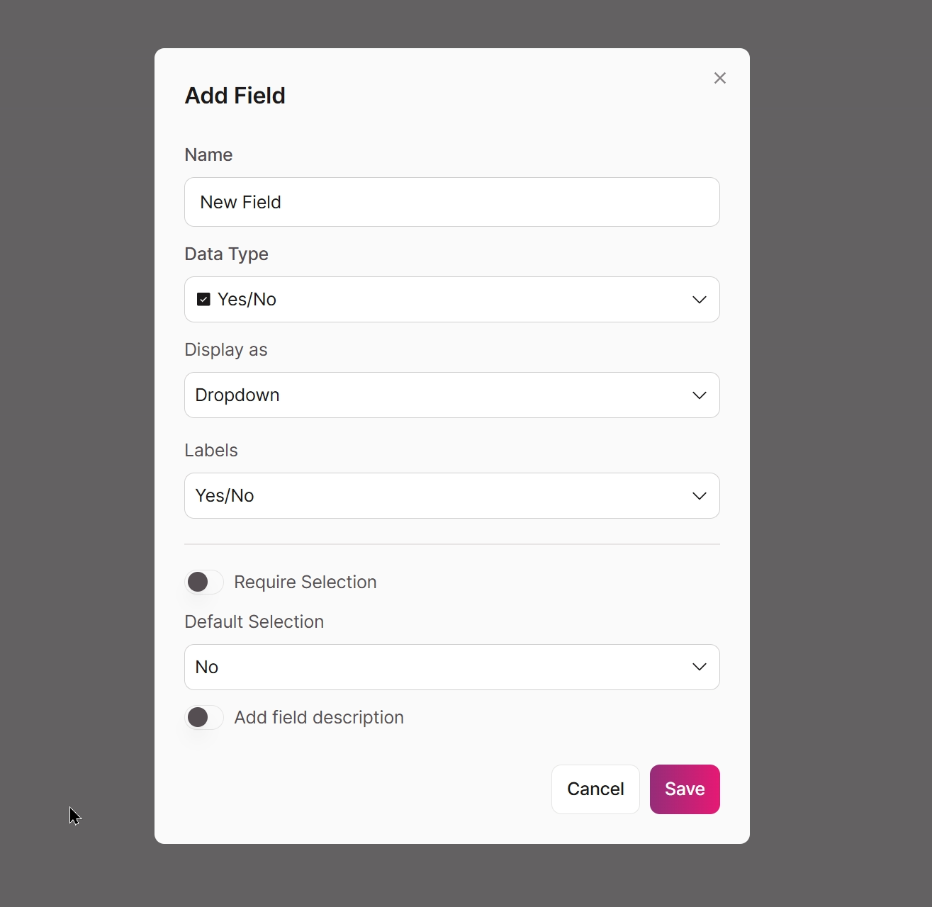
Boolean field settings
Basic Settings
- Name: Enter a descriptive name for your field. This will appear as the field label in forms and views.
- Data Type: Set to "Yes/No" to create a field with binary selection options.
Display Options
- Display as: Choose how the Yes/No field will be presented to users:
- Dropdown: Shows options in a dropdown menu
- Radio Buttons: Displays both options as individual radio buttons
- Checkbox: Shows a single checkbox (checked = Yes, unchecked = No)
Labels
- Yes/No: Default option for standard affirmative/negative responses
- True/False: Ideal for logical statements or factual verification
- On/Off: Best for activation status
Additional Settings
- Require Selection: When enabled, users must make a selection to submit a form.
- Default Selection: Specify which option (Yes or No) will be pre-selected when users interact with this field.
- Add field description: Provide helpful text in the DataTable field header.
Usage Notes
- Yes/No fields are stored as boolean values in your database (true/false).
- These fields can be used effectively in search filters, conditional rules, and for triggering actions.
Updated 3 months ago