Table Element Settings
Configure Table Element settings in Knack to control inline editing, column resizing, keyword search, record exporting, pagination, filtering, column summaries, and empty state display.
What You'll Learn
Table Element settings let you control how data is displayed and how users interact with it in the Live App. This article covers all five settings panels available on a Table Element: Title & Description, General Settings, Data Display, Actions, and Styling.
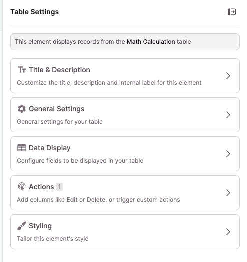
Accessing Table Element Settings
To open a Table Element's settings, select the element in the center panel of the builder. The settings panel opens on the right side. You'll see five sections you can configure:
- Title & Description — Set the element title, description, and internal label
- General Settings — Control user options and pagination
- Data Display — Configure fields, column summaries, filtering, sorting, limits, and empty state
- Actions — Add action columns for editing, viewing, deleting, linking, or triggering dynamic actions on records. See Actions for full details.
- Styling — Adjust the visual style of the element
General Settings
General Settings has two subsections: User options and Pagination.
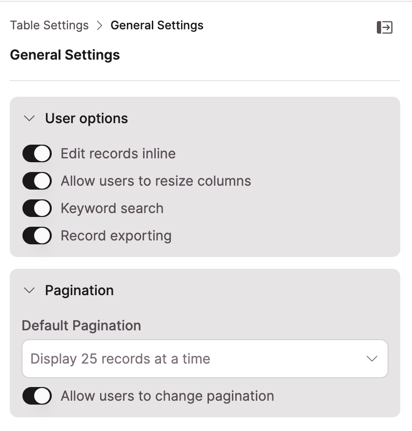
User Options
Edit records inline: When enabled, users can click a cell in the Table to edit the field value directly without leaving the page. See Adding Inline Editing to Tables for full configuration details.
Allow users to resize columns: When enabled, users can drag column borders in the Live App to adjust column widths.
Keyword search: When enabled, a search field appears above the Table. Users type keywords to filter displayed records. A reset link appears in the results to clear the search.
NoteKeyword search combines with any source filters applied to the Table Element.
Record exporting: When enabled, an Export button appears above the Table. Users can download the Table data as a .csv, .txt, or JSON file. Exported data reflects exactly what the Table is displaying, including any active sorting and filters.
Pagination
Default Pagination: Set the default number of records the Table displays at a time. Options are 10, 25, 50, or 100 records.
Allow users to change pagination: When enabled, a "per page" dropdown appears at the bottom of the Table in the Live App, letting users adjust how many records they see at once.
Data Display
Data Display has three tabs: Fields, Settings, and Filtering.
Fields Tab
Use the Fields tab to configure which columns appear in the Table and how each column is displayed. See Table Column Settings for full details.
Settings Tab
The Settings tab contains five sections.
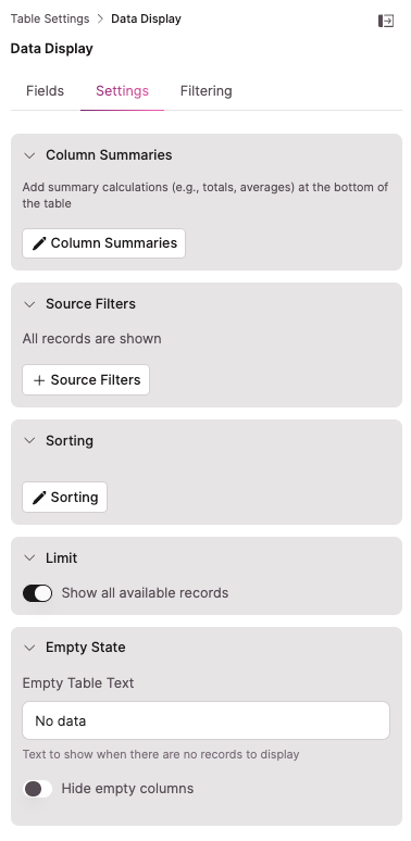
Column Summaries: Add summary calculations that appear at the bottom of a column. Supported types include totals and averages. Select Column Summaries to configure which columns show summaries and which calculation type to use.
NoteColumn summaries are only available for numeric fields.
Source Filters: Control which records the Table displays by default. Select Source Filters to add filter conditions. By default, all records are shown.
Sorting: Set a default sort order for the Table. Select Sorting to configure which field to sort by and the sort direction.
Limit: Toggle Show all available records to control whether the Table is capped at a set number of records. When the toggle is off, you can set a specific record limit.
Empty State: Configure what the Table shows when there are no records to display.
- Empty Table Text: The text shown when the Table has no data. Defaults to "No data." Edit the field to customize this message.
- Hide empty columns: When enabled, columns with no data are automatically hidden from the Table.
Filtering Tab
The Filtering tab controls whether users can filter Table records in the Live App and how.
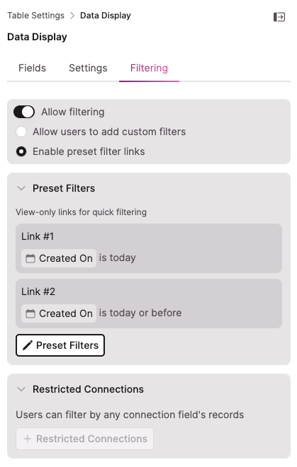
Allow filtering: The master toggle for all user-facing filter controls. When off, no filter options appear in the Live App.
When Allow filtering is on, choose one of two modes:
- Allow users to add custom filters: Adds an "add filters" button to the Table in the Live App. Users can build and modify their own filter criteria on the fly.
- Enable preset filter links: Adds view-only filter buttons above the Table that you configure. Users click a link to apply that filter but can't edit the filter criteria.
Custom Filters
When Allow users to add custom filters is selected, a Custom Filters section appears below.
Which fields can be filtered?: Use the dropdown to control which fields users can filter by. The default is "The fields being used by this element," which limits filtering to columns displayed in the Table. You can change this to include all fields in the source table.
Set default custom filters: Select + Default Custom Filters to add filter conditions that are automatically applied when the Table first loads. Users can modify or remove these in the Live App.
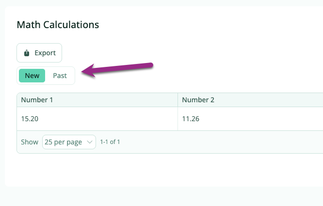
Preset Filter Links
When Enable preset filter links is selected, a Preset Filters section appears below.
Select + Preset Filters to open the configuration modal. For each link, set:
- Link Text: The tab label shown to users in the Live App
- Link Filter: The field and condition that filter applies
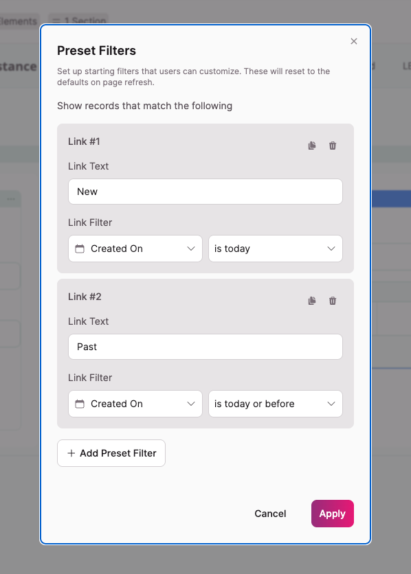
You can add as many links as needed. In the Live App, the links render as a tabbed menu above the Table. Users click a tab to instantly filter the Table to that preset. Tabs can't be modified by users in the Live App. When the page is refreshed, the Table defaults back to the first tab.
Restricted Connections
The Restricted Connections section appears at the bottom of the Filtering tab regardless of which filter mode is selected. By default, users can filter by any connection field's records. Select + Restricted Connections to limit which connected records are available when users filter a connection field.
See Table Elements: Restricted Connection Filters for full configuration details.
Next Steps
- Table Column Settings — Configure individual column display, labels, and sorting
- Adding Inline Editing to Tables — Set up and restrict inline editing per column
- Table Elements: Restricted Connection Filters — Control which connected records appear when users filter connection fields