Table Column Settings
Learn how to add, manage, and configure columns in a Knack Table Element, including column headings, grouping, connection settings, display rules, and field formatting.
What You'll Learn
This article covers everything related to columns in a Table Element: how to add columns from your data, how to edit, move, and delete them, and the full range of column-level settings available in the Column Properties panel.
Adding Columns
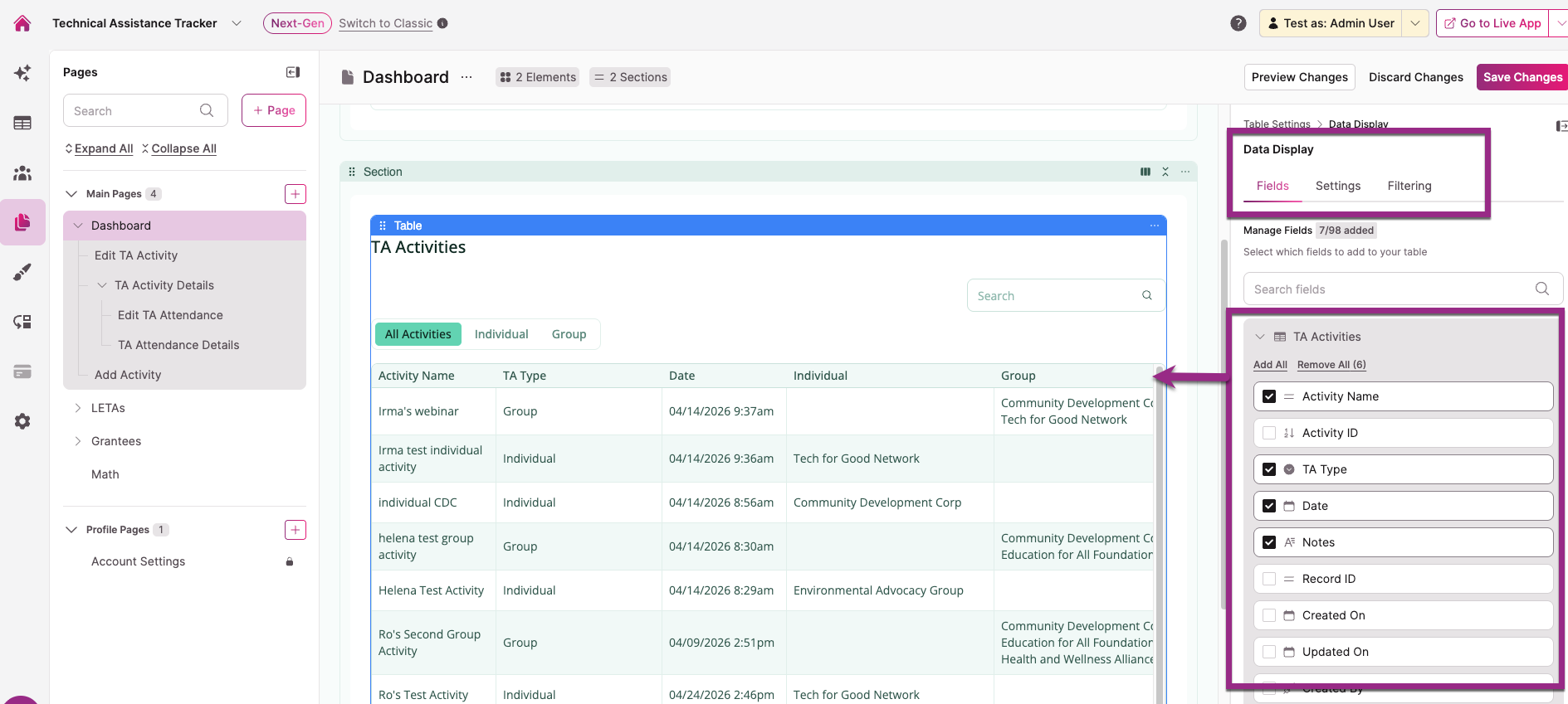
Columns are managed in the Data Display > Fields tab of the Table Element settings. Select the Table Element in the center panel of the builder to open the settings panel on the right, then navigate to Data Display and select the Fields tab.
From the Primary Table
The Fields tab lists all fields from the Table's source table. Click a field to add it as a column, or drag it onto the Table preview.
From Connected Tables
If your source table has connections to other tables, connected fields are also available to add as columns. Tables must be connected in the Data section of the Builder before connected fields appear here.
Action Columns
You can add action columns that let users interact with individual records directly from the Table, such as editing a record, viewing details, deleting a record, or triggering a custom action. See Actions for full details.
Managing Columns
Editing a Column
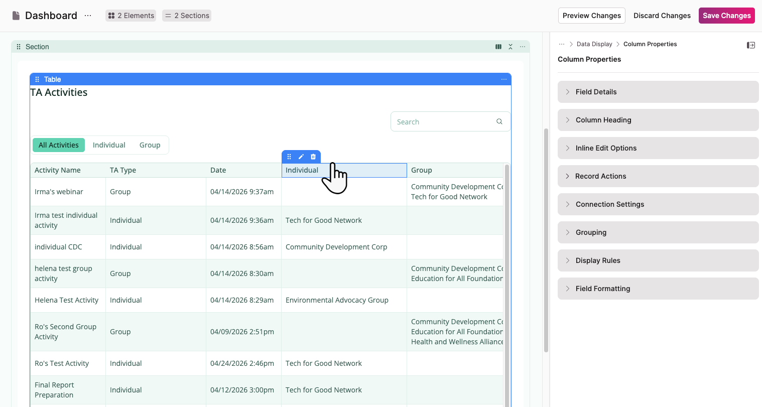
To open a column's settings, click the column in the Table preview. A small toolbar appears above it with three icons: move, edit (pen), and delete. Select the pen icon to open the Column Properties panel on the right.
Moving Columns
To reorder columns, click the move icon (grid dots) in the column toolbar and drag the column to a new position.
Deleting a Column
Select the trash icon in the column toolbar to delete it. If the column contains an action link that created a child page, deleting the column also deletes that child page unless it's connected to another element.
Column Properties
The Column Properties panel has seven collapsible sections.
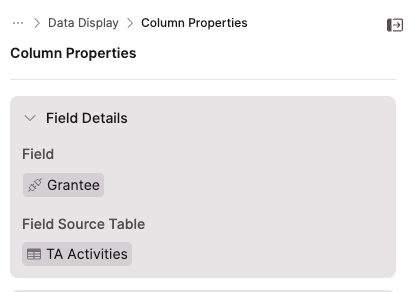
Field Details
Displays read-only information about the column's source:
- Field: The name of the field used for this column
- Field Source Table: The table the field comes from
You can't change which field a column uses after it's added. To rename a field, update it in the Data section of the Builder.
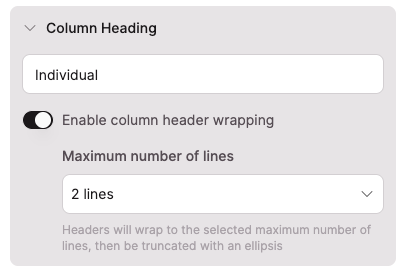
Column Heading
Column Heading: The label displayed as the column header in the Table. Defaults to the field name. You can change it to any text you want.
Enable column header wrapping: When enabled, long header labels wrap across multiple lines instead of being cut off. Use the Maximum number of lines dropdown to set the limit. Headers that exceed the line limit are truncated with an ellipsis.
Inline Edit Options
This section only appears when Edit records inline is enabled in the Table Element's General Settings. It controls inline editing behavior at the individual column level.
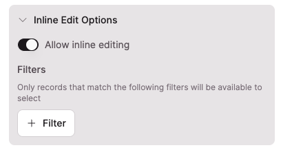
Allow inline editing: Toggle this off to disable inline editing for this specific column. All other columns with inline editing enabled are unaffected.
Conditional rules and inline editingFields with a conditional rule set to Run with every record can't be edited inline. Fields with a Custom conditions rule can be edited inline when the conditions are not met. See Conditional Rules for details on trigger types.
Filters: This subsection only appears on connection field columns. Use it to restrict which connected records appear in the dropdown when a user edits this field inline. Select + Filter to add one or more filter conditions. Only records that match all active filters will be available to select.
NoteThese filters only affect the inline edit dropdown for this column. They don't affect filtering, display, or any other part of the Table.
For more detail on configuring inline edit filters on connection fields, see Table Elements: Restricted Connection Filters.
Record Actions
Record actions let you trigger automated actions from a column, such as updating a record, updating connected records, inserting a connected record, or sending an email.
NoteRecord actions require inline editing to be enabled on the Table Element. See Adding Inline Editing to Tables.
See Record Actions for full configuration details.
Connection Settings
For columns that display connected field values, the Connection Settings section contains a Link to an existing page toggle. When enabled, the field value becomes a link that navigates users to a related page in your app.
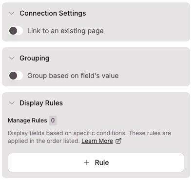
Grouping
The Grouping section contains a Group based on field's value toggle. When enabled, Table records are grouped by the values in this column. Columns with grouping enabled are automatically moved to the front of the Table.
NoteIf your Table displays row summaries (totals, averages), those also display for each group level when grouping is active.
Display Rules
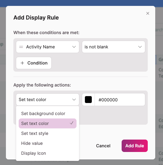
Display rules change how a column looks based on conditions you define. Select + Rule to open the rule configuration modal.
Each rule has two parts:
- When these conditions are met: Define one or more field conditions that trigger the rule. All conditions must be true for the rule to apply. Select + Condition to add multiple conditions.
- Apply the following actions: Define the visual change to apply when the conditions are met. Select + Action to apply multiple actions to the same rule.
Available actions include: Set text color, Set text style, Set background color, Display icon, and Hide value.
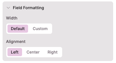
Field Formatting
Width: Choose Default (based on field name length) or Custom to set a specific width.
NoteYou can't make a column narrower than its header text or the longest unbroken string of characters in a field value (such as a long URL or filename).
Alignment: Set the horizontal alignment of data in the column: Left, Center, or Right.
Next Steps
- Table Element Settings for configuring Table-level settings including pagination, filtering, and column summaries
- Adding Inline Editing to Tables for enabling and managing inline editing across your Table
- Table Elements: Restricted Connection Filters for controlling which connected records appear when users edit connection fields inline
Updated 3 months ago