Calendar General Settings
This guide covers how to configure your Calendar Element settings to customize its appearance, functionality, and data display.
What You'll Learn
This article walks you through the various configuration options for Calendar Elements. You'll learn how to control which data appears, how it's formatted, and what interactive capabilities are available to your users.
Accessing Calendar Settings
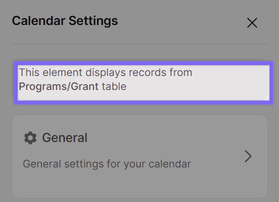
To access the settings of a Calendar Element, select the element on the page editor and the right panel will open. There, you will find the General, Data Display, Event Details, and Add Event Form selections.
💡The source table for the calendar is displayed above the General section.
General Settings
The General section includes basic configuration options for your Calendar Element:
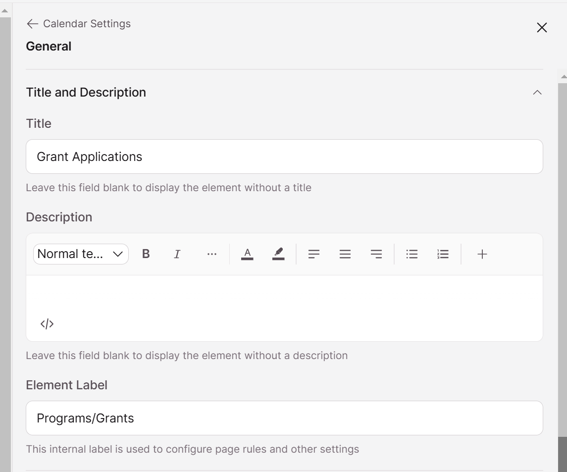
Title and Description
- Title: Enter a title to display above your calendar (e.g., "Grant Applications"). Leave this field blank to display the element without a title.
- Description: Add descriptive text that will appear below the title. The description field includes formatting options like bold, italic, lists, and alignment. Leave blank to display the element without a description.
- Element Label: This internal label (e.g., "Programs/Grants") is used to configure page rules and other settings but isn't visible to users.
Appearance Settings
The Appearance section controls how your calendar looks and functions:
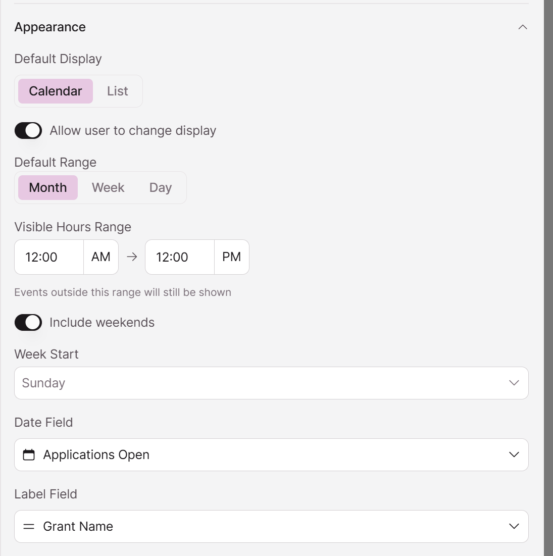
Display Options
- Default Display: Choose between Calendar (graphical interface) or List (text-based rows) format.
- Allow user to change display: When enabled, users can switch between calendar and list views.
Time Range Options
- Default Range: Select Month, Week, or Day as the default calendar view.
- Visible Hours Range: Set the time range displayed in week and day views (e.g., 12:00 AM to 12:00 PM). Events outside this range will still be shown.
- Include weekends: Toggle to show or hide weekends on your calendar.
- Week Start: Choose whether weeks start on Sunday or another day.
Field Selection
- Date Field: Select which Date/Time field from your table will be used to position events on the calendar.
- Label Field: Choose which field (typically a text field like "Grant Name") will be displayed as the event title.
By default, new calendars will use the first date/time field in the table's field list as the source to display records in the calendar. The first short text field will serve as the label, and the first seven fields will be used for displaying popup details.
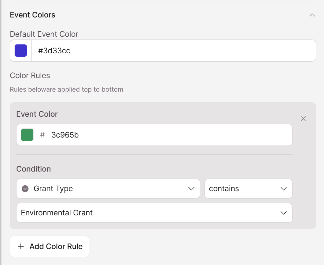
Event Colors
Customize how events are visually displayed on your calendar:
- Default Event Color: Set the standard color for all events (e.g., #3d33cc).
- Color Rules: Create rules to display events in different colors based on specific conditions. Rules are applied from top to bottom.
- Add Color Rule: Click to create a new conditional color rule for events.
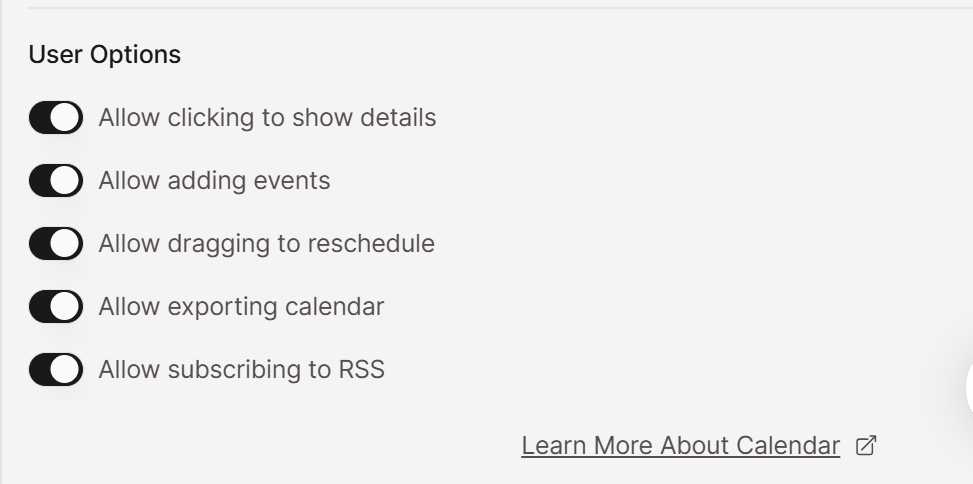
User Options
Control the interactive features available to your users:
- Allow clicking to show details: When enabled, users can click on events to view additional information.
- Allow adding events: When enabled, users can add new events to the calendar.
- Allow dragging to reschedule: When enabled, users can drag events to change their date and time.
- Allow exporting calendar: When enabled, users can export calendar data.
- Allow subscribing to RSS: When enabled, users can subscribe to an RSS feed of calendar events.
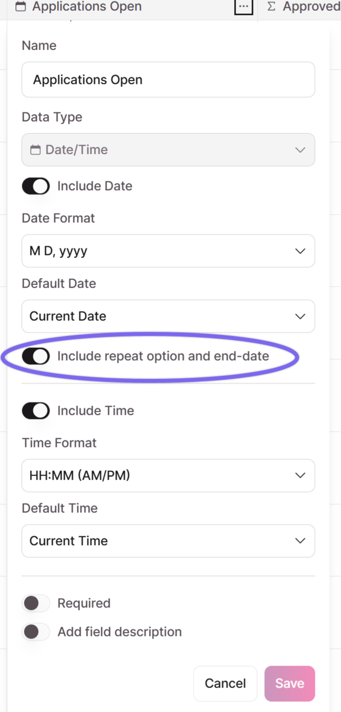
💡### Adding All Day and Repeating Events
To enable the option of adding all day and repeating events, make sure the Date/Time field in your source table has "include repeat option and end-date enabled.