Charts
What you'll learn:
- How to add and configure different chart types
- Customization options for appearance and branding
- Interactive features and user controls
- Best practices for effective data visualization
Getting Started with Charts
Adding Charts to Your Page
The Charts element serves as a flexible container for displaying multiple visualizations on a single page. When you add this element, you create a dedicated space where your app's data transforms into meaningful visual representations that help users understand trends, patterns, and insights at a glance.
To add Charts to your page:
- Navigate to the Knack Page Editor
- Select the Charts element from the available page elements
- Configure the chart container settings
- Add individual charts within the container
The Charts section integrates seamlessly with your existing page elements, allowing you to combine visualizations with forms, tables, and other content types. Your charts automatically reflect current data from connected tables, ensuring visualizations remain accurate and up-to-date.
Understanding Chart Structure
Charts follow a hierarchical structure that makes organizing and managing multiple visualizations straightforward:
- Chart Container: Acts as the main wrapper for all visualizations
- Individual Charts: Each with independent configuration settings and data sources
- Layout Options: Flexible column arrangements for optimal display
This structure provides several advantages:
- Group related visualizations together for easier navigation
- Apply consistent styling across multiple charts
- Simplify management through centralized control
- Support responsive layouts for different screen sizes
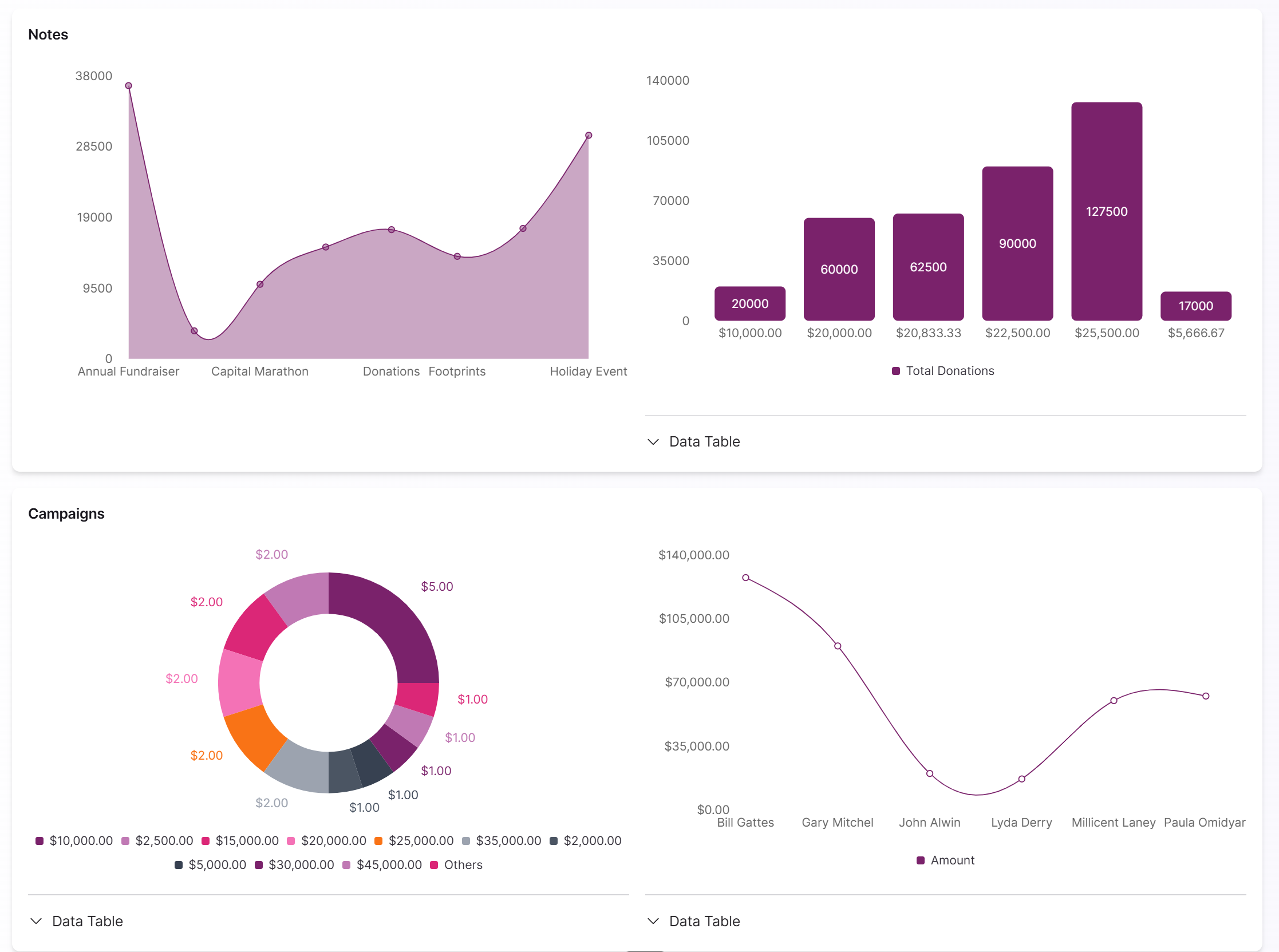
Available Chart Types
Knack supports four primary chart types, each designed for specific data relationships and presentation needs:
Area Charts
Perfect for showing trends over time while emphasizing magnitude and cumulative effects. The filled areas below the line create strong visual impact, making them ideal for:
- Sales figures over time
- User registration trends
- Inventory level tracking
- Resource consumption patterns
Bar Charts
Provide the clearest way to compare values across categories. The vertical bars enable immediate visual comparisons, excellent for:
- Sales performance by region
- Survey response categories
- Performance metrics comparison
- Categorical data analysis
Line Charts
Excel at displaying connected data points across continuous scales. These charts clearly show trends and patterns, perfect for:
- Performance tracking over time
- Progress monitoring toward goals
- Seasonal pattern identification
- Multiple data series comparison
Donut and Pie Charts
Show how individual parts contribute to a whole, ideal for proportional data. The circular format works best for:
- Budget allocation breakdowns
- Market share distribution
- Demographic composition
- Percentage-based data (5-7 categories maximum)
Configuring Your Charts
Accessing Chart Settings
Chart configuration provides comprehensive control over every aspect of your visualizations. To access settings:
- Click directly on the Charts section header in the Knack Builder
- Use the configuration panel that opens on the right side
- Navigate through organized tabs for different setting types
- Access individual chart settings for detailed customization
The interface organizes settings into logical sections, making it easy to find options without feeling overwhelmed by the full range of available features.
Chart Layout and Organization
Choose from flexible layout options to create visually appealing and functional dashboards:
Single Column
- Best for charts requiring maximum width
- Ideal for detailed line charts or bar charts with many categories
- Optimal for mobile device viewing
- Ensures clear data display without crowding
Two Column
- Excellent balance between space efficiency and clarity
- Perfect for displaying complementary charts side by side
- Great for showing different views of the same data
- Enables direct comparison between related metrics
Three Column
- Maximizes visualization density for executive dashboards
- Ideal for monitoring multiple metrics simultaneously
- Requires careful attention to chart complexity
- Best for overview pages with simple visualizations
The layout system automatically adapts to different screen sizes, ensuring charts remain functional and visually appealing across desktop, tablet, and mobile devices.
Adding and Managing Individual Charts
Use the "Add Chart" button to expand your dashboard with new visualizations. The system guides you through:
- Chart Type Selection: Choose based on your data and user needs
- Configuration Setup: Define data sources and display options
- Customization: Refine appearance and behavior
- Organization: Arrange charts in logical sequences
Management Features:
- Reorder: Use move functionality to arrange charts logically
- Duplicate: Copy existing charts and modify specific settings
- Delete: Remove outdated charts with appropriate warnings
Chart Configuration Options
General Settings
Control fundamental aspects of your chart's appearance and behavior through comprehensive general settings.
Title and Description
Chart Titles
- Optional but recommended for user guidance
- Should be concise yet informative
- Include key metrics and relevant time frames
- Examples: "Monthly Sales Performance" or "Customer Satisfaction by Region"
Rich Text Descriptions
- Support bold formatting and color highlighting
- Provide context for complex data relationships
- Explain data collection methods or seasonal patterns
- Guide user attention to important insights
- Balance informativeness with brevity
Appearance Customization
Stacking Options
- None: Display each data series independently for direct comparisons
- Normal: Combine series by adding values together, showing cumulative totals
- Percent: Transform data into proportional representations showing relative contributions
Line Type Configuration
- Curved Lines: Create smooth, flowing visualizations emphasizing overall trends
- Straight Lines: Provide precise representations of actual data points
Visual Elements
- Tilt Category Labels: Accommodate longer text strings while maintaining readability
- Data Label Visibility: Show/hide individual values directly on chart elements
- Contrast Settings: Choose between monochromatic subtlety or high contrast accessibility
Legend Placement
- Left: Traditional, formal appearance with easy reference
- Right: Space-efficient for longer labels, follows natural reading flow
- Below: Maximizes horizontal chart space, optimal for mobile viewing
- None: Remove legend for cleaner visuals when not needed
Chart Options and User Experience
Show Data Table
- Provides toggle button for switching between chart and table views
- Supports accessibility and different user preferences
- Enables precise data analysis when exact values are needed
- Maintains same filtering and sorting logic as chart view
Hide Empty Groups
- Automatically removes categories with no data
- Creates cleaner, more focused visualizations
- Reduces visual clutter for sparse datasets
- Adapts dynamically as data changes
Hide Negative Ranges
- Controls display of negative values
- Focuses attention on positive performance
- Adjusts scale to start from zero or lowest positive value
- Use thoughtfully to avoid misleading users
Allow Exporting
- Enables users to download chart data or images
- Supports external reporting and analysis workflows
- May include various formats (images, CSV, PDF)
- Availability depends on Knack plan features
Data Display Settings
Control how charts connect to and present your app's data through sophisticated filtering, grouping, and organization options.
Source Filters and Data Management
Source Filters
- Specify exactly which records to include in visualizations
- Use same filtering logic available throughout Knack
- Support conditions based on field values, date ranges, user permissions
- Enable complex combinations of multiple criteria
Filter Examples:
- Show only current year records
- Display only records for logged-in user
- Include only specific status criteria
- Combine multiple conditions for precise data selection
Source filters update dynamically, ensuring charts reflect data changes while maintaining established criteria.
Categories and Grouping
Group Configuration
- Define how data should be categorized and aggregated
- Support multiple grouping levels for complex organization
- Enable different insights from the same dataset
Label Fields
- Provide user-facing names for data categories
- Create more readable presentations than raw field names
- Appear in chart legends, axis labels, and data tables
Category Field Selection
- Determines basis for grouping data
- Fundamentally affects chart organization
- Examples: Campaign names, date fields, status fields, geographic data
Order Configuration
- A to Z: Alphabetical ordering for predictable navigation
- Numerical: Quantitative ordering for numerical categories
- Date-based: Chronological ordering for time-related fields
Multiple Category Support
- Create nested groupings through "Add Category" functionality
- Enable sophisticated analysis beyond single-level categorization
- Support complex analytical needs
- Example: Group by time period, then by product category
Filtering Options
Provide essential functionality for creating interactive, user-controlled visualizations that adapt to different analytical needs.
User-Controlled Filtering
Allow Filtering Option
- Transforms static charts into interactive analytical tools
- Provides user controls for modifying displayed data
- Supports various interaction patterns based on configuration
- Maintains performance through efficient filter application
Filter Capabilities:
- Select specific categories to include/exclude
- Choose date ranges for time-based analysis
- Apply multiple filter criteria simultaneously
- Create highly focused data views
User Experience Features
Data Table Toggle
The data table toggle provides seamless switching between visual charts and structured tabular data, addressing diverse user preferences and accessibility needs.
Functionality:
- Clear "Data Table" button near each chart
- Transforms visual chart into organized table
- Maintains data relationships and filtering logic
- Enables switching without losing applied filters
Benefits:
- Accessibility: Supports users who prefer tabular data
- Precision: Provides exact values for calculations
- Analysis: Better support for detailed comparisons
- Flexibility: Accommodates different analytical workflows
Interactive Elements
Charts include intuitive interactive elements that encourage data exploration:
Legend Interactions
- Help users understand visual components
- Enable focus on specific data series
- Provide clear, descriptive labels
Visual Feedback
- Confirms user interaction effects
- Maintains analytical flow
- Shows impact of filter changes
- Supports seamless exploration
Best Practices
Chart Selection Guidelines
Choose chart types based on your data characteristics and user needs:
Area Charts: Use when magnitude and cumulative effects matter
Bar Charts: Best for direct category comparisons
Line Charts: Ideal for trends over continuous scales
Donut/Pie Charts: Perfect for part-of-whole relationships (limit to 5-7 categories)
Note - Currently charts are limited to 9 columns/categories, with remaining categories grouped as "Others".
Design Principles
Color and Contrast
- High contrast for accessibility and device compatibility
- Monochromatic for sophisticated, professional appearance
- Consider viewing conditions and user capabilities
Layout Considerations
- Single column for complex charts requiring width
- Two column for complementary visualizations
- Three column for metric monitoring dashboards
Data Labels
- Show for operational reporting requiring precision
- Hide for trend analysis where visual clarity matters
- Balance precision needs with visual simplicity
Performance Optimization
Data Management
- Use source filters to limit processing requirements
- Consider data point limits for complex visualizations
- Implement aggregation strategies for large datasets
Layout Efficiency
- Single column requires less simultaneous processing
- Multi-column layouts need more browser resources
- Balance information density with performance
Interactive Features
- User filtering adds processing overhead
- Overhead typically justified by analytical value
- Design for efficient filter application
Troubleshooting
Common Data Issues
Missing or Incorrect Data
- Check source filter restrictions
- Verify category field selections
- Ensure consistent data formatting
- Review permission-based filters
Advanced Techniques
Multi-Chart Dashboard Design
Information Flow
- Start with overview charts for context
- Progress to detailed visualizations
- Support progressive understanding
- Avoid information overload
Layout Strategy
- Three-column for compact metric monitoring
- Two-column for complementary perspectives
- Single-column for complex detailed analysis