Link Group Elements
Link Groups provide a way to organize navigation within your Knack app, helping users find and access different pages easily. With various styling options and link types, menus can be customized to fit your app's design and functionality needs.
What You'll Learn
In this guide, you'll discover how to use Link Group elements to create intuitive navigation in your Knack app. You'll learn to build both button and tabbed links, link to internal pages or external sites, and customize the appearance of your navigation to match your app's design. Effective navigation is key to user experience, and this guide will help you build links and menus that make your app more accessible and easier to use.
What is a Link Group Element?
A Link Group element serves the purpose of showcasing links to additional pages within your application or external websites.
Link Groups are a handy tool for organizing multiple pages and elements. For instance, if a page becomes too cluttered with a grid listing numerous records and a form to add a new record, you can simplify navigation for users by linking to the form element from a menu element.
What do Link Groups Look Like in a Live App?
This Link Group is positioned below a Details element and provides the functionality to open modal popups for users to conveniently edit or add records.
Managing Menus
To learn how to add, edit, and delete elements from your app, see our Elements Overview article.
Link Group Settings
To access the settings of a menu element, hover over the element and click on the pen icon that appears at the top left corner.
In the menu settings, you can edit aspects of the menu such as the title, description, format, and design of the menu element:
The following options are available in the menu element's settings:
-
Link to a new page: Create a link to a new page within your app. You will be guided through the setup process to add your new page.
-
Link to an existing page: Add a link to a page that already exists in your app. You can choose another parent page or a page that originates from a menu element on a parent page.
-
Link to a URL: Include a link to an external website.
-
Title: Give your menu element a title that will appear above the element.
-
Description: Add text that will appear alongside the title above the menu element. Descriptions provide valuable context to users about the links in the menu element.
-
Tabbed Menu: Menus can be customized to show as buttons or tabs. By default, the buttons are separated, but if you enable the Tabs option, the menu button will be visible even on child pages and the tabs will stay on the page as you click through them.
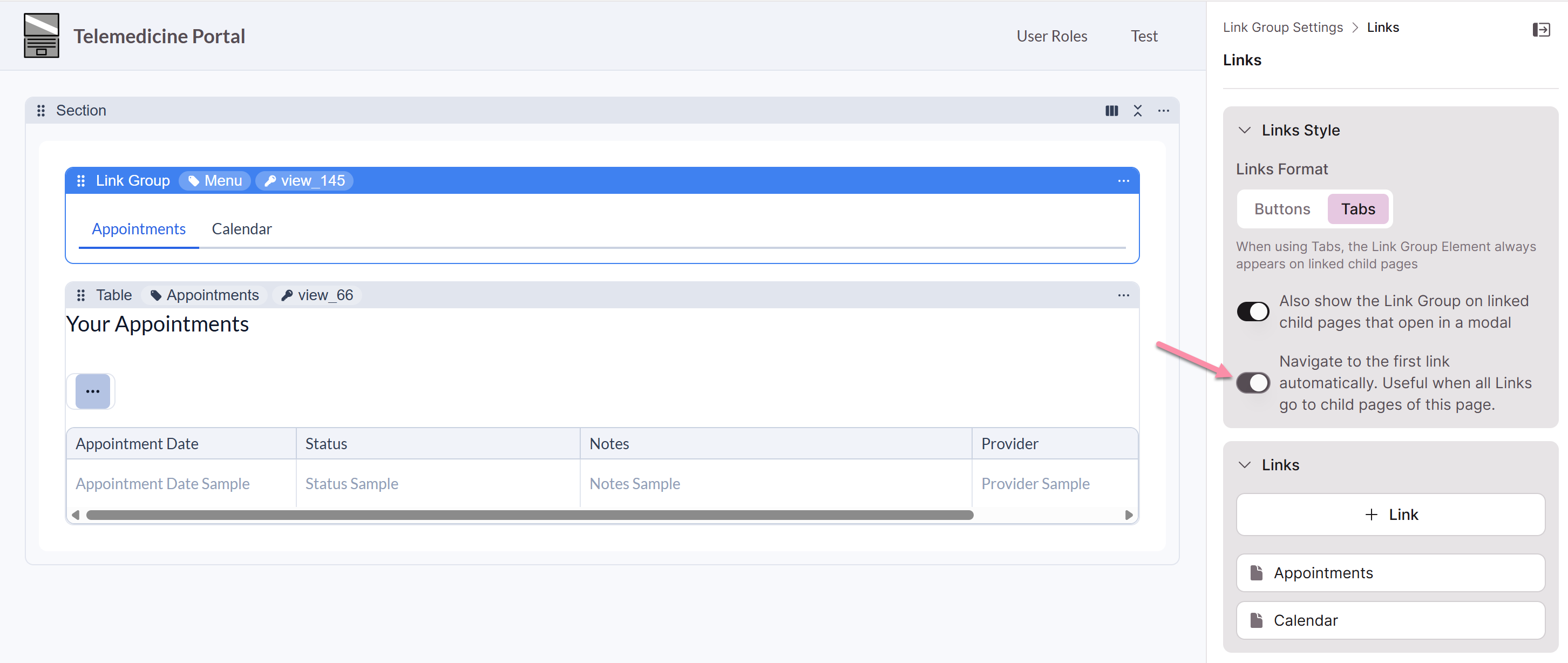
Controlling Link Group Visibility in Modals
When a child page opens as a modal, you can control whether the parent page's Link Group tab menu appears inside the modal. This is useful when the Link Group tabs aren't relevant to the modal content and would add visual clutter.
By default, Link Group tab menus from the parent page are visible in modal views. You can turn this off so that modals display only the child page content, without the surrounding tab navigation.
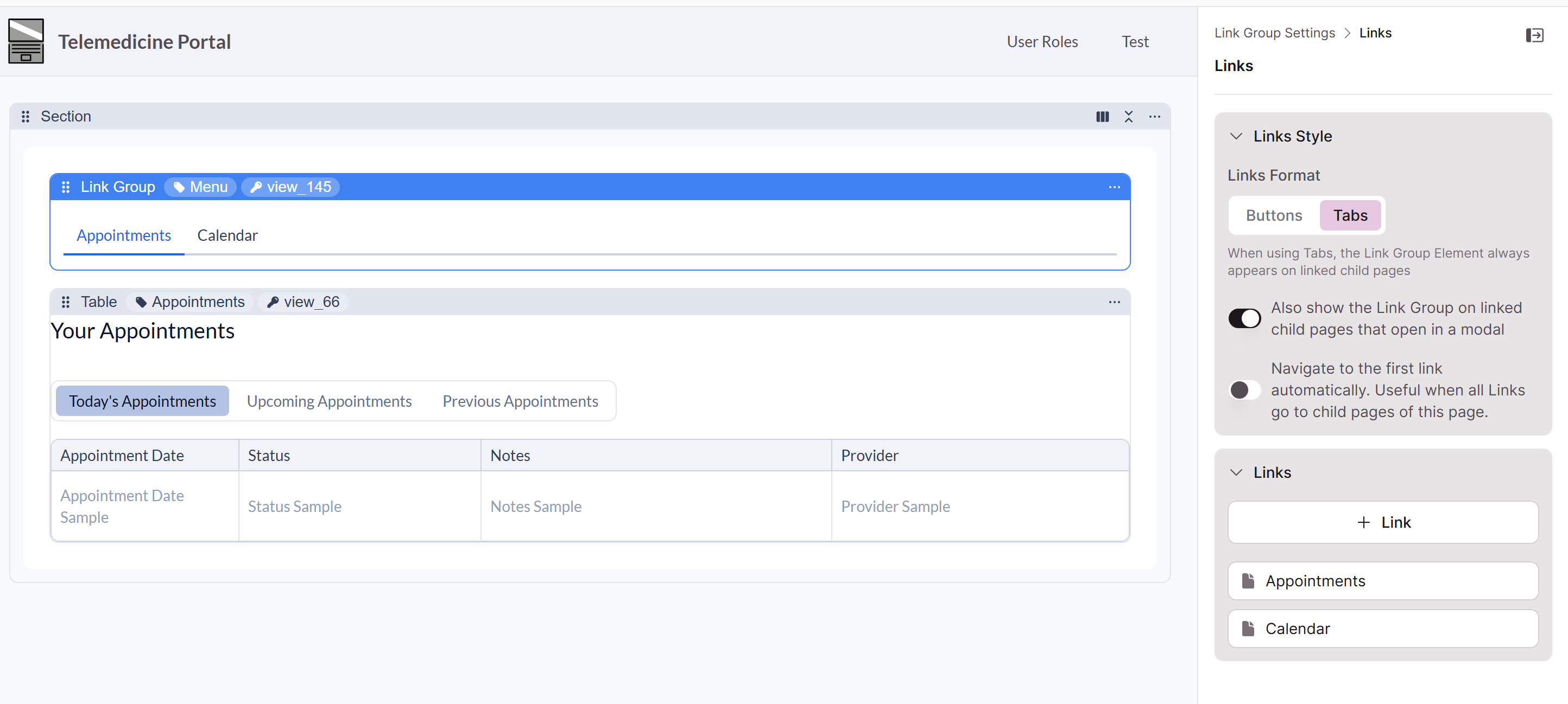
Auto-Link for Tabbed Link Groups
When your Link Group is set to the tabbed option, you can enable Auto-Link to automatically navigate to the first link's content when the page loads. This eliminates the experience of landing on an empty-looking page when the Link Group itself has no content elements — users are taken directly to the first link's content without having to click anything.
The tab menu remains visible as users navigate through child pages, so they can still move between links as expected.
To enable Auto-Link, look for the toggle in your Link Group tab settings:
"Navigate to the first link automatically. Useful when all Links go to child pages of this page."
How the First Link Affects Display
The first link in the group determines whether the entire Link Group renders. If the first link is an external URL, opens in a new tab, or isn't a child page, the Link Group may not display at all.
To avoid this, make sure the first link in your group is a child page that opens in the same tab. You can reorder your links at any time to change which link is first.
Best Practices
- Hide Link Group tabs in modals when they aren't relevant. If a modal is meant to show a focused piece of content — like a detail view or a form — turning off the tab menu keeps the experience clean.
- Use Auto-Link when your Link Group has no standalone content. If the Link Group page itself is just a navigation shell for child pages, Auto-Link ensures users always land on something meaningful instead of a blank page.
- Put a child page link first. Since the first link controls whether the Link Group renders, always place a same-tab child page link in the first position. Move external links or new-tab links further down in the list.
Editing Menu Buttons
To modify existing menu buttons, interact with the individual buttons on the page preview. From there, you can update link properties, rearrange the order of links, and delete links as needed.
Link Properties
To edit each individual menu link, hover over the menu link in the page preview and click on the pen icon to open the editor.
The Link Properties editor offers a range of options for customization:
-
Page: This section displays a link to the page your link redirects to when clicked. To modify the page linked to your menu link, you will need to delete the menu link and create a new one with the desired page.
-
Link Text: Modify the text that will be displayed in the button on the menu element.
-
Icon: Icons can be added when adding or editing a button in the menu element. You can select the "+ Add Icon" button to choose an icon.
When selecting an icon, you can also edit the alignment in the Edit Icon modal pop-up:
- Left: The icon will appear on the left side of the button text.
- Right: The icon will appear on the right side of the button text.
-
New Window: By enabling this option, all button links will open in new windows in your browser.
Link Order
To rearrange the order of the menu buttons, simply click and drag a button to a new position on the menu element in the page preview.
Deleting Menu Links
To remove a menu button, hover over the button in the page preview and click on the trashcan icon.
Caution! If the link is connected to a child page, deleting the menu button will also delete that page.
Updated 3 months ago