Search Elements
What You'll Learn
This comprehensive overview will help you understand how to create and configure search elements that make your app data easily discoverable. You'll learn about the various search options available, how to set up search inputs and results, and how to customize the search experience to match your specific requirements. By the end, you'll be able to build sophisticated search functionality that helps users quickly locate the records they need.
What are Search Elements?
A Search element in your Live App lets users search and view multiple records from a data table. You can configure it to include search inputs from fields in the source table as well as fields from connected tables.
You can also choose which fields to display in the search results - again from both the source and connected tables. Results can be shown in either a grid or list layout, giving you control over both the search experience and how data is presented.
What do Search Elements Look Like in the Live App?
Search elements provide a clean, intuitive interface where users can enter their search criteria and view results in an organized format. The search inputs appear at the top, followed by the results displayed in either a grid or list layout based on your configuration.
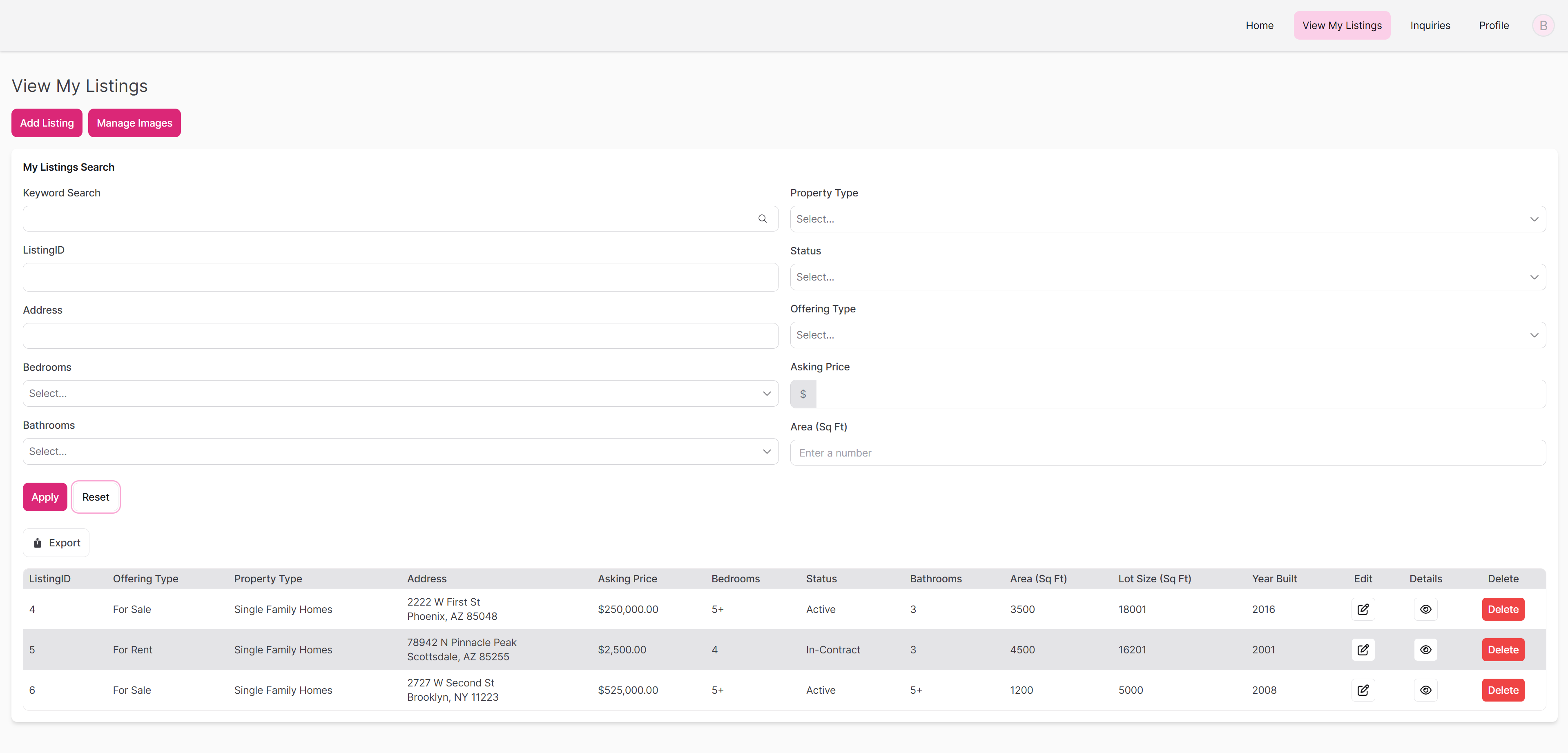
Advanced Search view with results in a table format
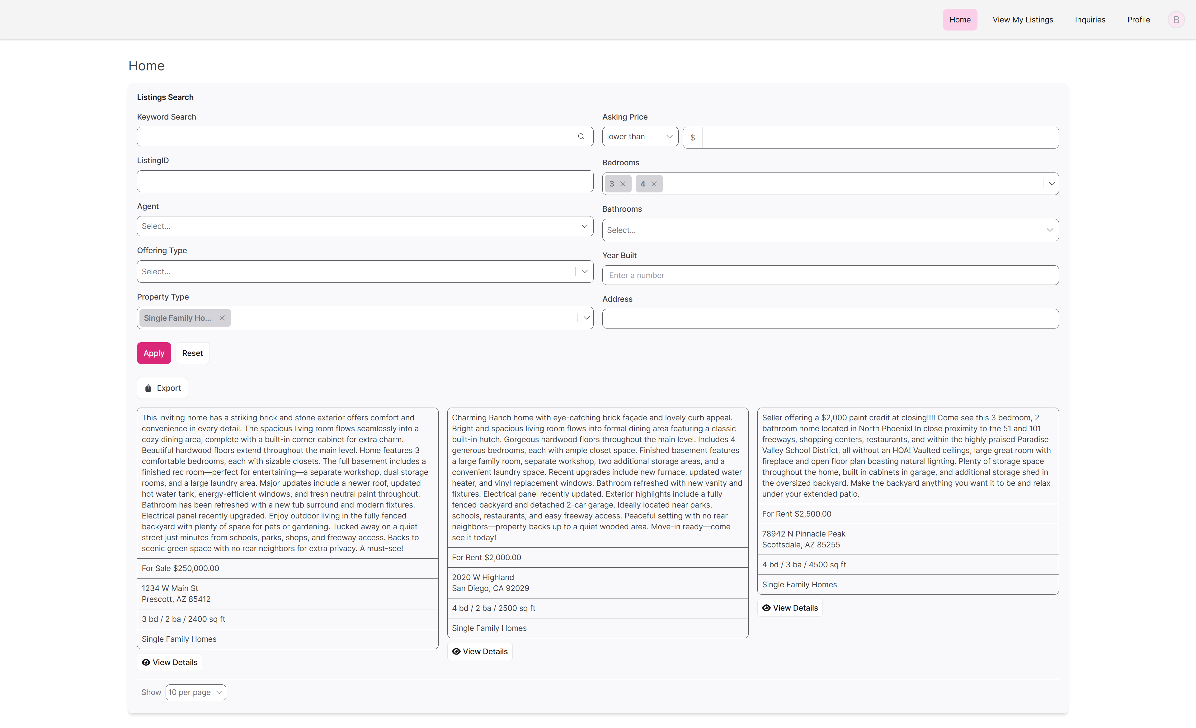
Advanced Search view with results in a list format
Managing Search Elements
Adding, editing, and deleting elements are managed the same regardless of element type. To learn how to add, edit, and delete search elements from your app, see our article: About Elements.
Search Element Settings
General
The General section controls the basic setup of your search element:
- Title and Description - Add labels and explanatory text for your search element
- Display result options - Choose between table or list format for results
- Empty states - Customize messages when no results are found
- Inline editing - Allow users to edit values directly in table results
- Record exporting - Enable CSV, TXT, or JSON export options
- Pagination options - Control how many results appear per page
Search Inputs
Keyword Search Field
The Keyword Search field allows users to enter freeform text and search across one or more fields in your data. This is ideal when you want to provide a simple search bar that scans multiple fields for matching values—similar to how a search engine works.
Toggle this option on to include a keyword search input at the top of your search element. When enabled, users can type in a phrase or keyword to quickly filter results.
Label
Customize the label that appears above the keyword input. By default, it's labeled "Keyword Search," but you can rename it to better match your app's tone or purpose (e.g., Search Listings, Find Projects, etc.).
Which Fields Can Be Searched?
Decide which fields the keyword search will scan when a user types something in:
Fields used by this element: Only search fields that are already displayed in the search results or configured in the search inputs.
All fields in the source table: Broaden the keyword search to include every field in the table the element is pulling records from, even if they’re not shown in the element itself.
Advanced Search
The Advanced Search section allows you to give users more precise filtering options. Instead of a single keyword input, advanced search uses individual fields (like dropdowns, text fields, or date pickers) to let users build detailed queries.
Columns Layout
Choose how the search inputs are displayed on the page:
- 1 Column: All inputs are stacked vertically
- 2 Columns: Inputs appear in two equal-width columns
- 3 Columns: Inputs are arranged in three columns for a more compact layout
This helps you organize long or complex search forms in a more user-friendly way.
Advanced Search Fields
Here, you select which fields users can search by. You’ll see a list of all available fields from the source table and any connected tables.
You can easily add or remove fields depending on what you want users to filter by with the checkmark to the left of the field name.
Each added field can be further customized by selecting the pencil icon that appears on hover on the right side of the field. Here, you can change its label, add instructions, mark it as required, set a default value, or allow the user to change the filter type. This enables even greater precision - depending on the field type, the user might have choices such as "is any", "is not" "is blank", "is not blank", and many more.
💡Use case example: You might include fields like "Status", "Assigned To", or "Start Date" in an advanced search so users can quickly narrow the results to just records they need.
Search Results
The Search Results section controls how records are displayed once a search is performed. You can customize which fields appear in the results table, apply sorting and filters, define formatting, and even configure rules for conditional display.
Fields
This area allows you to manage which fields from your data table (and connected tables) are shown in the search results.
Adding Fields
- Add or remove individual fields using checkmarks
- Use "Add All" or "Remove All" for bulk changes
- Search for specific fields by name
- Drag and drop fields in the page editor area to reorder columns
Field Customization
Click the pencil icon that appears when hovering on a field to:
- Rename Column Heading - Use more user-friendly names
- Adjust Formatting - Change how the data appears
- Set Width - Define column width in pixels or let it auto-size
- Choose Alignment - Left, center, or right-align the content
- Configure Separators - For multi-choice fields, choose comma-separated or line-separated display
✏️ Tip: Rename column headings to be more user-friendly (e.g., change “ListingID” to “Listing Number”).
💡When searching using multiple fields, results will only include records that match all specified criteria (AND logic). To broaden results within a single field, you can use the “is any” filter to match any of the selected values for that field.
Settings
Customize how your results table or list behaves and appears:
Record Actions
Enable or disable built-in record actions like Edit or Delete directly from the results table.
- Edit - Allow users to modify records directly
- Delete - Let users remove records
- Custom Actions - Add links to other pages or trigger specific functions
🔧 Inline editing must be enabled to use Edit in a table.
Column Summaries
Add calculations that appear at the bottom of numeric columns:
- Sum - Total all values in the column
- Average - Calculate the mean value
- Minimum - Show the lowest value
- Maximum - Show the highest value
Note: Column summaries are only available in grid format, not list format.
Sorting
Set the default sort order for your results by choosing a field and direction (ascending or descending). This sort applies only to this search element and will override any default table-level sorting.
Source Filters
Apply filters that control which records can appear in your results before users even search. This is useful for:
- Showing only records with a certain status
- Filtering by user roles
- Limiting results to specific categories or date ranges
Limit
Limit the number of records shown in the results. If not set, all matching records will be displayed.
Empty State
Customize the message shown when no records match the search criteria.
💡 Enter a helpful message (e.g., “No listings found. Try adjusting your filters.”)
Hide empty columns
Choose to automatically hide columns with no data to improve clarity.
Display Rules
Use Display Rules to show or hide fields dynamically based on specific conditions in your data.
Example: Show a "Discount" field only when the "Customer Type" is "Premium."
Pagination
Control how results are divided across multiple pages:
Records Per Page
Choose how many records to show at once.
User Control
Allow users to change the number of records per page themselves.
Static Elements
You can add non-searchable elements to organize your search interface:
Rich Text
Add headings or explanatory text within your search element to guide users.
Divider
Insert visual separators between different sections of search fields to improve organization.
These static elements help create a more organized and user-friendly search experience, especially when you have many search options available.
Keyword Search Notes
When performing keyword searches, the search term must be at least two characters long and should not include any special characters. Keep the following in mind:
"Is" and "Is not" filters match the exact word. For example, searching for “is apples” will return records containing “apples” or “oranges and apples,” but not “orangeapples” or “apples123.”
Searching using "is" with a phrase, such as “is oranges and apples,” will only return records that contain the exact phrase “oranges and apples.”
"Contains" and "Does not contain" filters allow partial matches. A search for contains “apples” will return results such as “apples,” “oranges and apples,” “orangeapples,” and “apples123.”
Email searches are an exception and currently do not follow the standard rules for "is" filters.
By default, search elements include the keyword search toggled on.