Customizing Your App's Visual Identity with the Theme Builder
What you'll learn:
- How to navigate the Theme Builder interface
- How to configure global styles including colors, fonts, and corner styles
- How to create custom gradients and ensure color accessibility
- How to customize table appearance for better data presentation
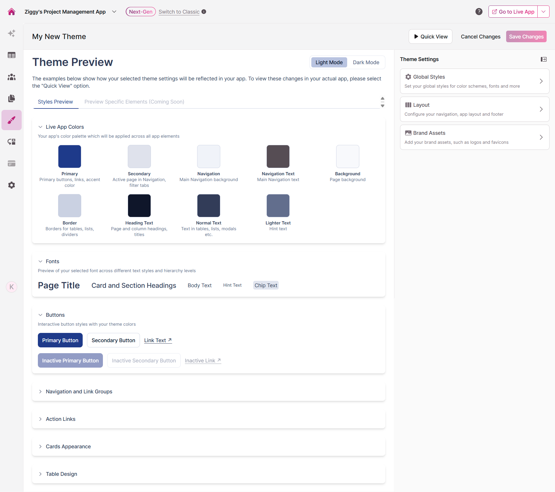
Understanding the Theme Builder Interface
The Theme Builder is your design command center, split into two panels that work together to help you create the perfect look for your app.
On the left, you'll see a preview of your theme in action. Toggle between Light and Dark modes to see how your choices adapt, and explore different UI elements in the Styles Preview tab to ensure everything looks just right.
The right panel is where the magic happens. This is your control center for all theme settings, organized into three intuitive sections: Global Styles, Layout, and Brand Assets.
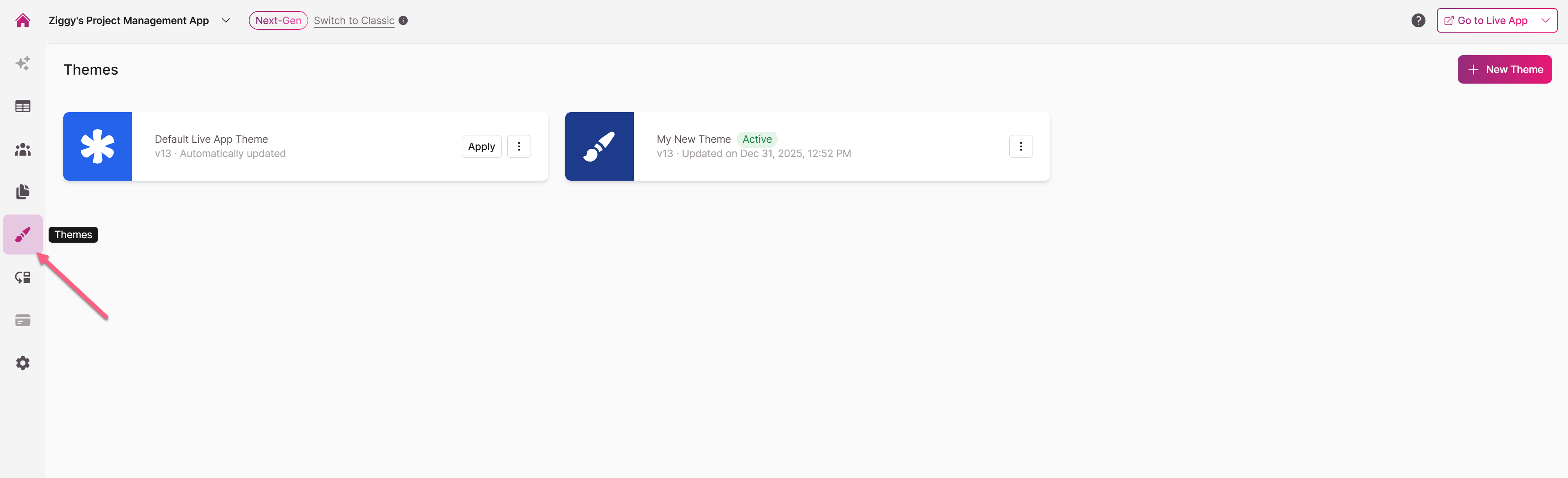
Getting Started with Themes
Navigate to the Themes area in your app builder to begin. From here, you can:
- Create a new theme from scratch
- Import an existing theme
- Edit any theme you've already created
Click on any theme to open the Theme Builder. The Default Theme is locked and can't be modified - it's there as a reliable fallback.
For existing themes, you can rename them, export them for reuse, duplicate them for variations, or delete them (as long as they're not currently active). There's no limit to how many themes you can create, so feel free to experiment. Click on an existing theme to edit it.
Configuring Global Styles
Global Styles form the foundation of your app's visual identity. These settings are applied universally across your app to create a consistent, professional experience.
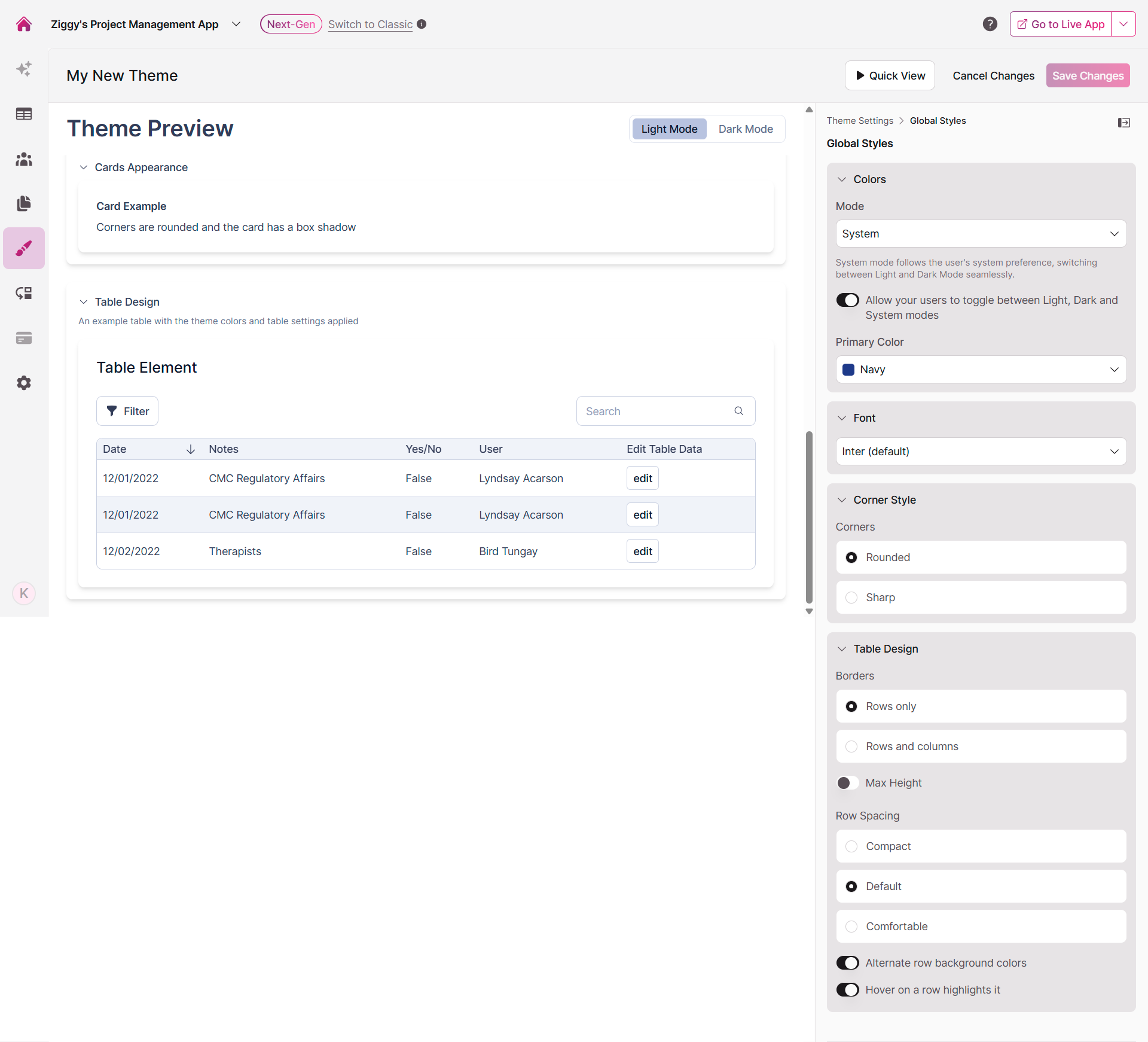
Setting Up Your Color System
The Colors section gives you complete control over your app's palette. It's built on an intelligent color system that automatically generates accessible shades based on your selections so you don't have to worry about creating dozens of color variations manually.
Choosing Your Display Mode
First, decide how your app should handle light and dark modes:
| Mode | What It Does |
|---|---|
| System (Default) | Automatically matches your users' operating system preference, switching between Light and Dark modes seamlessly |
| Light Mode Only | Locks your app to light mode regardless of user preference |
| Dark Mode Only | Locks your app to dark mode regardless of user preference |
Tip: Enable the "Allow your users to toggle between Light, Dark and System modes" option to put control in your users' hands. This adds a toggle to your app header so they can choose their preferred viewing mode.
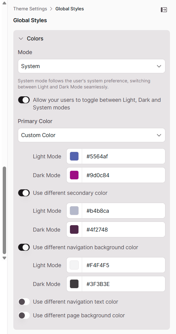
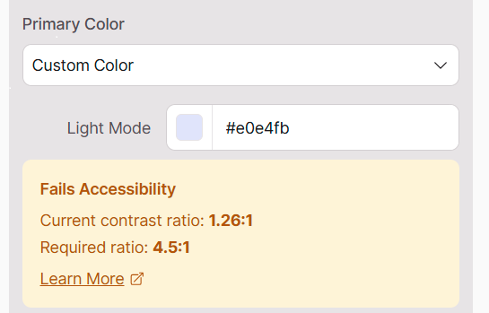
Selecting Your Primary Color
Your primary color is the star of the show - it's the accent color that appears on buttons, links, and other interactive elements throughout your app. You can choose from professionally curated presets or define your own custom color.
To use a custom color, select "Custom Color" from the dropdown, then use the color picker or enter a specific HEX value for both Light and Dark modes.
Fine-Tuning with Advanced Color Options
For more precise control, enable toggles to customize specific parts of your app:
- Use different secondary color: Choose the accent color for active navigation elements and filter tabs
- Use different navigation background color: Set a unique background for your main navigation menu
- Use different navigation text color: Control text color within your navigation menu
- Use different page background color: Define a custom background for your app's pages
Built-in Accessibility Checking
Your theme colors now include automatic accessibility checks to ensure your app is readable for everyone. When you select a custom color that doesn't meet contrast standards, you'll see an immediate alert in the theme editor.
What this means for you:
- Get instant feedback when text and background colors don't have enough contrast
- Make informed color choices during the design process
- Build apps that meet readability standards without guesswork
How it works:
The builder automatically checks whether your color combinations provide sufficient contrast for text readability. If a combination falls below accessibility standards, you'll see a clear alert—giving you the chance to adjust before going live.
Creating Custom Page Gradients
Want to add visual interest to your pages? The Theme Builder now supports gradient backgrounds. When you enable the "Use different page background color" toggle, you can select "Custom Gradient" from the dropdown to:
- Choose two colors to create your own gradient
- Adjust the gradient angle for the perfect direction
- Select from pre-designed preset gradients for both Light and Dark modes
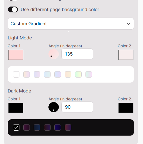
Tips for creating custom gradients -
Opt for angles between 120° and 165° for a natural flow
Avoid straight vertical (90°) or horizontal (0°) gradients
Consider 135° as a safe default angle
Choosing Your App's Typography
Select a font that reflects your brand while ensuring readability across all devices. The Theme Builder offers a curated collection of popular, versatile web fonts including Inter, Lato, Roboto, and more.
Tip: Using Custom Fonts
Have a specific brand font? Select "Custom" from the font dropdown, then provide the font name and a URL to the font's stylesheet (such as a Google Fonts link). Learn more here
Defining Your Corner Style
The corner style you choose sets the tone for your entire interface. Pick the option that best matches your brand aesthetic:
- Rounded: Soft, rounded corners for a modern, approachable feel
- Sharp: Crisp 90-degree corners for a traditional, structured appearance
Customizing Table Design
Tables are where users interact with your data, so their appearance and behavior matter. Configure these settings to optimize how information is presented:
| Setting | Options | What It Does |
|---|---|---|
| Borders | Rows only / Rows and columns | Choose between horizontal-only borders or a full grid for maximum separation |
| Max Height | Toggle on/off | When enabled, tables with many rows become scrollable instead of extending the page indefinitely |
| Row Spacing | Compact / Default / Comfortable | Adjust padding within table rows—compact for dense data, comfortable for easier scanning |
Additional table enhancements:
- Alternate row background colors (zebra striping) makes it easier to follow rows across columns
- Highlight rows on hover helps users track their position in large datasets
Both options significantly improve usability when working with extensive data.