Themes: General Layout
Navigating to Layout Settings
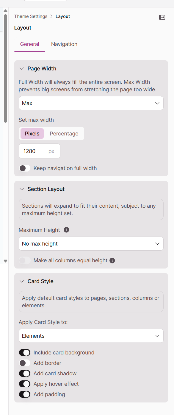
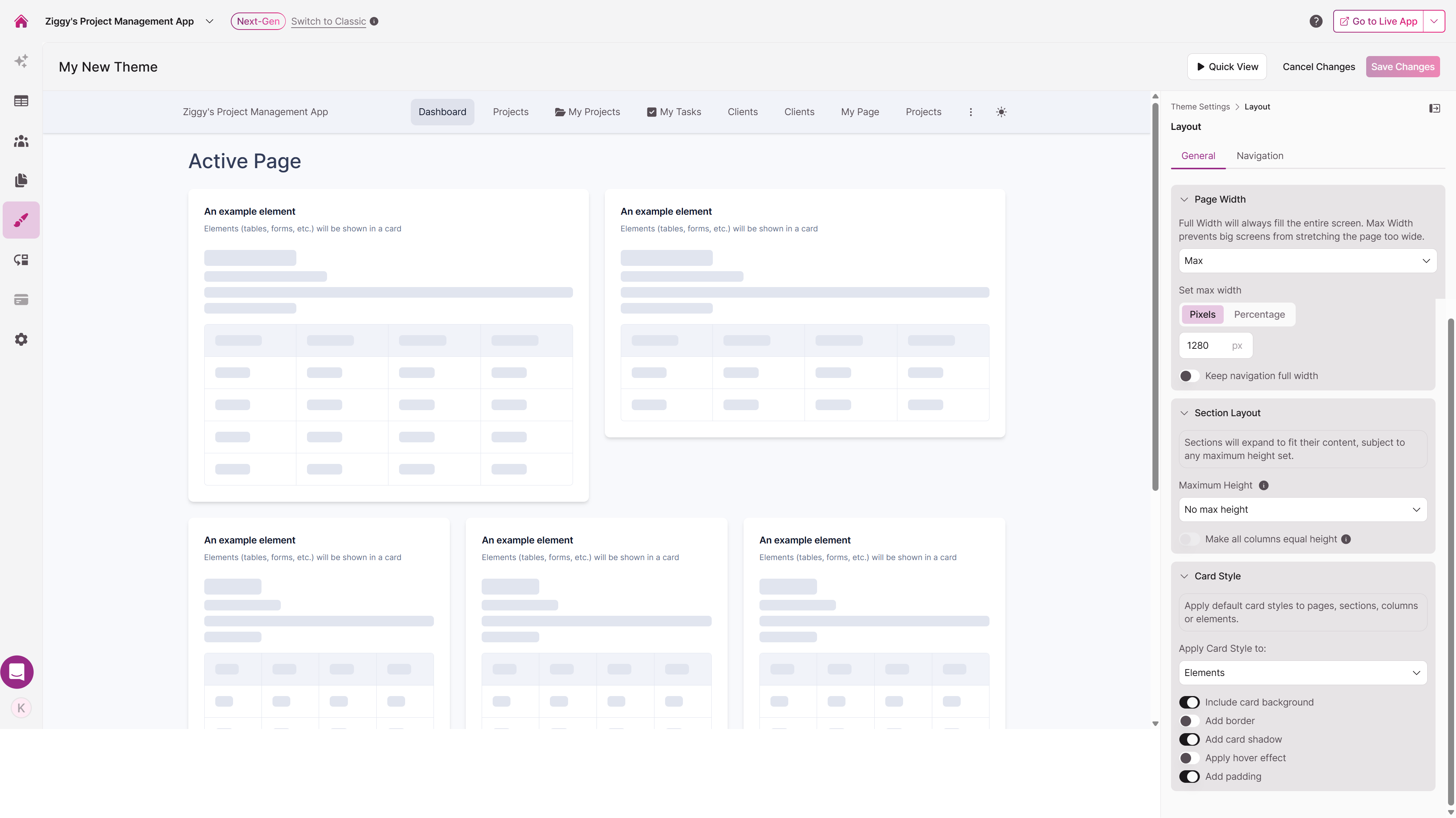
Ready to shape how your app is structured? From the main Theme Builder interface, click the Layout section in the right-hand settings panel. You'll find Layout settings organized into two tabs: General and Navigation.
Configuring General Layout
The General tab is where you define the fundamental structure and spacing of your app's pages. These settings create the framework that everything else builds upon.
Controlling Page Width
Choose how your content adapts to different screen sizes:
- Full Width: Page elements expand to fill the entire browser window, maximizing screen real estate
- Max Width: Constrains content to a maximum width, preventing text from stretching uncomfortably wide on large monitors. Define this width in pixels (px) or as a percentage (%)
Tip: You can keep your navigation full width while constraining page content—a popular design pattern in modern web apps that balances visual appeal with readability.
Managing Section Layout
Control the vertical spacing and alignment of sections to create a polished, organized appearance.
Maximum Height
Set a ceiling for how tall your sections can grow. Choose from:
- Small (40 viewport height)
- Medium (60 viewport height)
- Large (80 viewport height)
- Custom height
When content exceeds the maximum height, the section becomes scrollable—keeping your page layout intact.
Column Height
Enable "Make all columns equal height" to automatically match all columns to the height of the tallest one. This creates a clean, grid-like appearance in multi-column layouts instead of having columns that end at different points.
Styling Cards for Visual Organization
Cards are containers that visually group related content, making your app easier to scan and navigate. The Card Style settings let you apply a consistent, modern look across your app.
Where to Apply Cards
First, choose where you want the card style to appear using the "Apply Card Style" dropdown:
- Elements (default)
- Pages
- Sections
- Section Columns
- Do not apply card styles
Customizing Card Appearance
Once you've selected where to apply cards, refine their look with these options:
- Include card background: Adds a background color to distinguish cards from the page
- Add border: Creates a defined edge around each card
- Add card shadow: Lifts cards off the page with a subtle shadow for depth
- Apply hover effect: Provides visual feedback when users interact with cards
- Add padding: Creates breathing room between card content and edges
Note: These settings establish your app-wide defaults. You can override any of these card styles for individual elements in the Page Editor when you need specific sections to look different.