Legacy Action Link Styling
This guide provides a quick overview of the updated styling for action links in your applications. It covers how existing links are affected, the new default styles, and your customization options.
Frequently Asked Questions (FAQ)
What is changing with action links?
The styling for action links has been updated to provide a more modern and consistent look and feel across your applications. This update affects both existing and newly created action links.
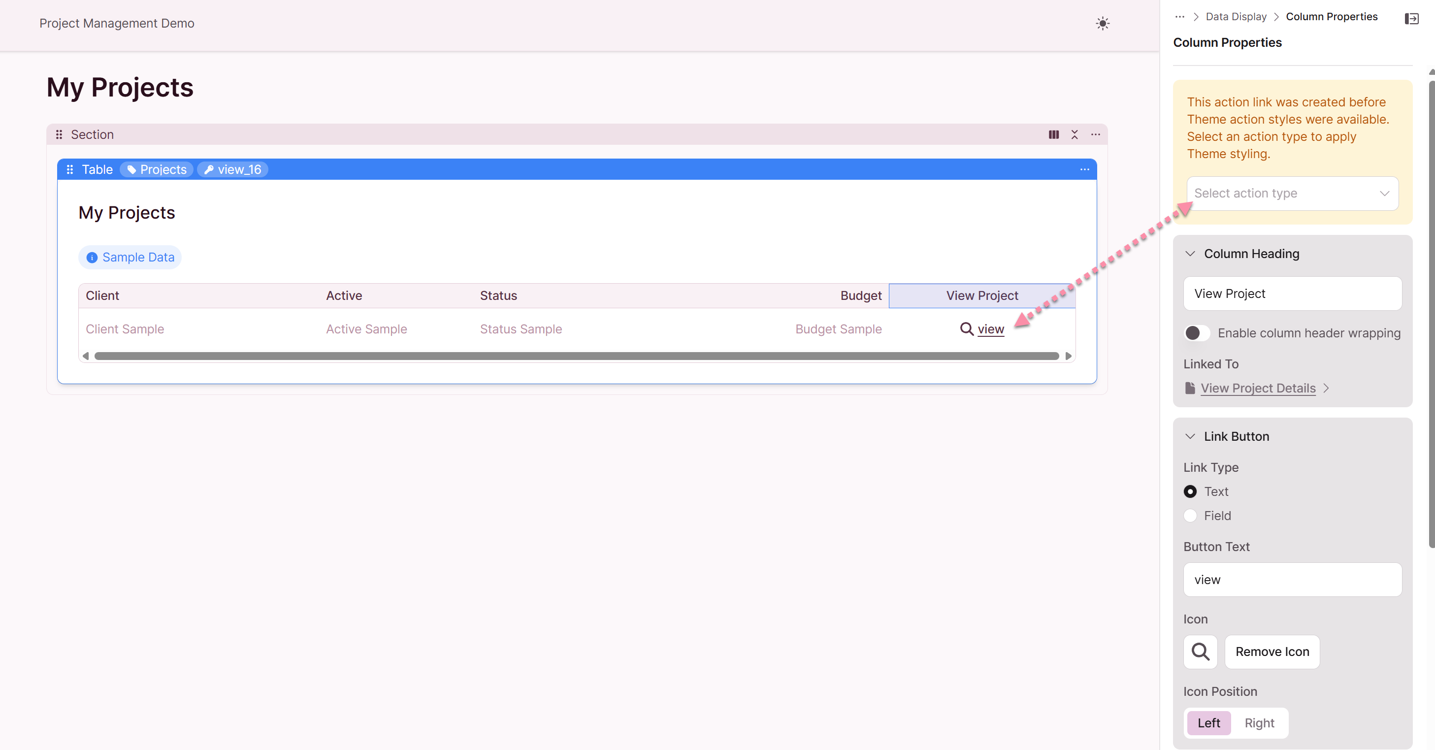
How will my existing action links look after the update?
Your existing action links will be updated, but you will have the option to opt-in to the new styling. The table below summarizes the changes for existing links:
| Existing Link Style | Action Type | Appearance without Theme | Appearance with Theme |
|---|---|---|---|
| Icon Only | View, Edit | Icon remains, no outline | Original icon with theme style applied |
| Icon & Text | View, Edit | Icon and underlined text | Original icon with theme style applied |
| Text Only | View, Edit | Underlined text | Theme style applied |
| Icon Only | Link | Icon remains, no outline | Icon with theme style applied |
| Icon & Text | Link | Icon and underlined text | Original icon with theme style applied |
| Text Only | Link | Underlined text | Link theme style applied |
| Icon Only | Delete | Icon remains, no outline | Original icon with theme style applied |
| Icon & Text | Delete | Icon and underlined text | Original icon with theme style applied |
| Text Only | Delete | Underlined text | Theme style applied |
Do I have old styling for my existing links?
For "View" and "Edit" action links, you will see a legacy notice and can choose which link type is applicable. If you have set up custom styling in Themes, the action link styling will be updated. Existing icons will not change.
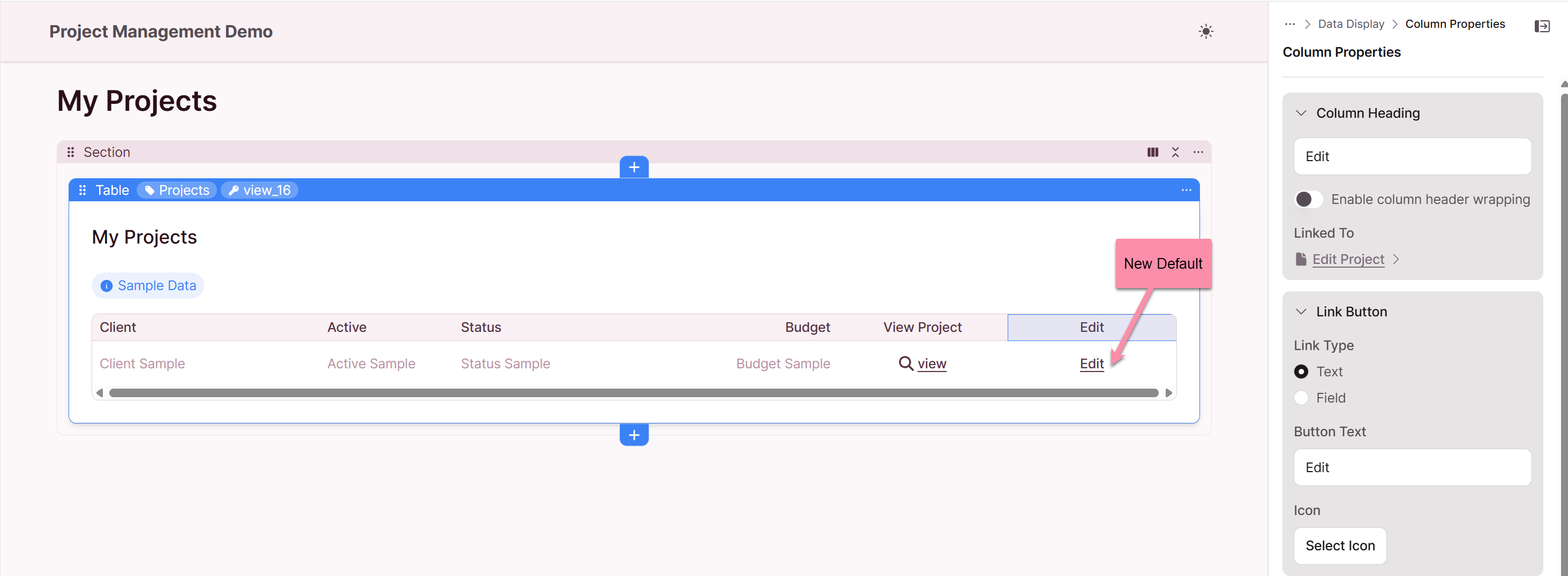
What do the new action links look like by default?
If you have not customized your themes, all new action links that you create (including "View", "Edit", and "Delete") will appear as underlined text by default.
How can I customize the appearance of my action links?
You can customize the appearance of your action links by configuring your app Themes. Navigation to Themes: Global Settings: Action Links. When you have a theme configured, your action links will adopt the styles you have defined, such as button styles, colors, and icons.
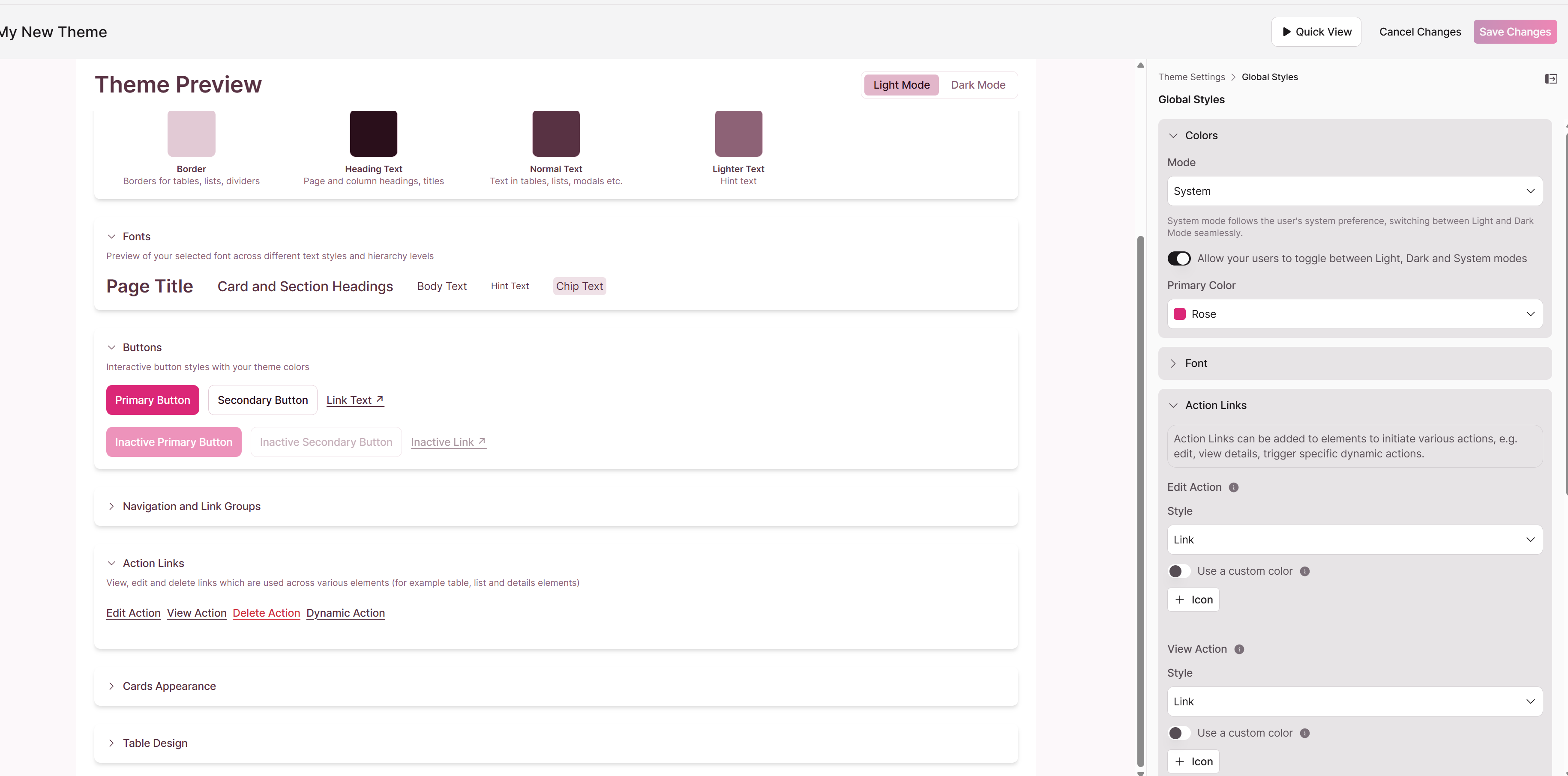
What are "Page Links" and "Dynamic Actions" and how are they styled?
"Page Links" and "Dynamic Actions" types of links that have customized styling. By default, they appear as underlined text with 2-line header wrapping. When you have a theme configured, they will adopt your custom theme styles.
Summary of Action Link Styling
The following table provides a high-level summary of the action link styling:
| Scenario | Styling | Notes |
|---|---|---|
| Existing Links | Varies based on original style and theme | For legacy links, select the applicable link type |
| New Links (No Theme) | Underlined text | This is the new default for all action links |
| New Links (With Theme) | Custom styles | Links will adopt your defined theme styles |
We hope this guide helps you understand the new action link styling.