Themes: Global Styles: Action Link & Label Customization
Customize the appearance of action links and labels across your app to create a polished, on-brand experience.
What you'll learn:
- How to style action links globally across your application
- How to customize label formatting in views
- Best practices for creating visual hierarchy and user-friendly interfaces
Action Link Styling
Action links—like Edit, View, Delete, and Dynamic Actions—now offer flexible styling options to match your design preferences.
Understanding the Default Appearance
Newly created action links display as underlined text by default, unless you have set a new default in Themes.
Customizing Action Link Styles
You can apply one of three global styles to all action links in your application:
To customize action links:
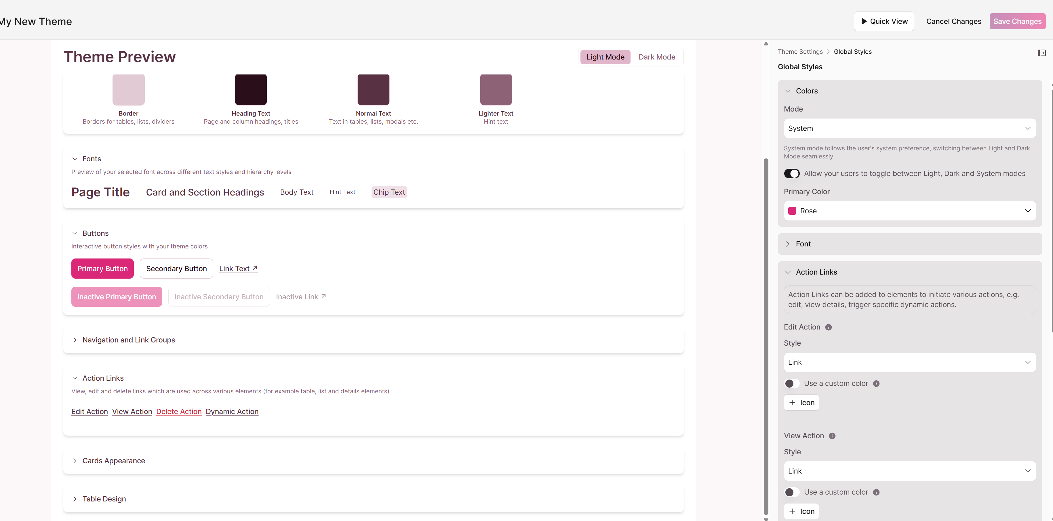
- Navigate to Themes → Global Styles
- Locate the Action Links section
- Select one of three styling options:
- Filled Button – High visibility for primary actions
- Outline Button – Softer emphasis for secondary actions
- Link – Minimal underlined text (current default)
- Set a custom color for your selected style
- Click Save
Note: All new action links will adopt the style you select.
Label Customization
Labels identify fields in multiple view types, including List, Details, Search, Calendar, and Map views. You can customize how these labels appear to create clear visual hierarchy.
Available Customization Options
To customize labels:
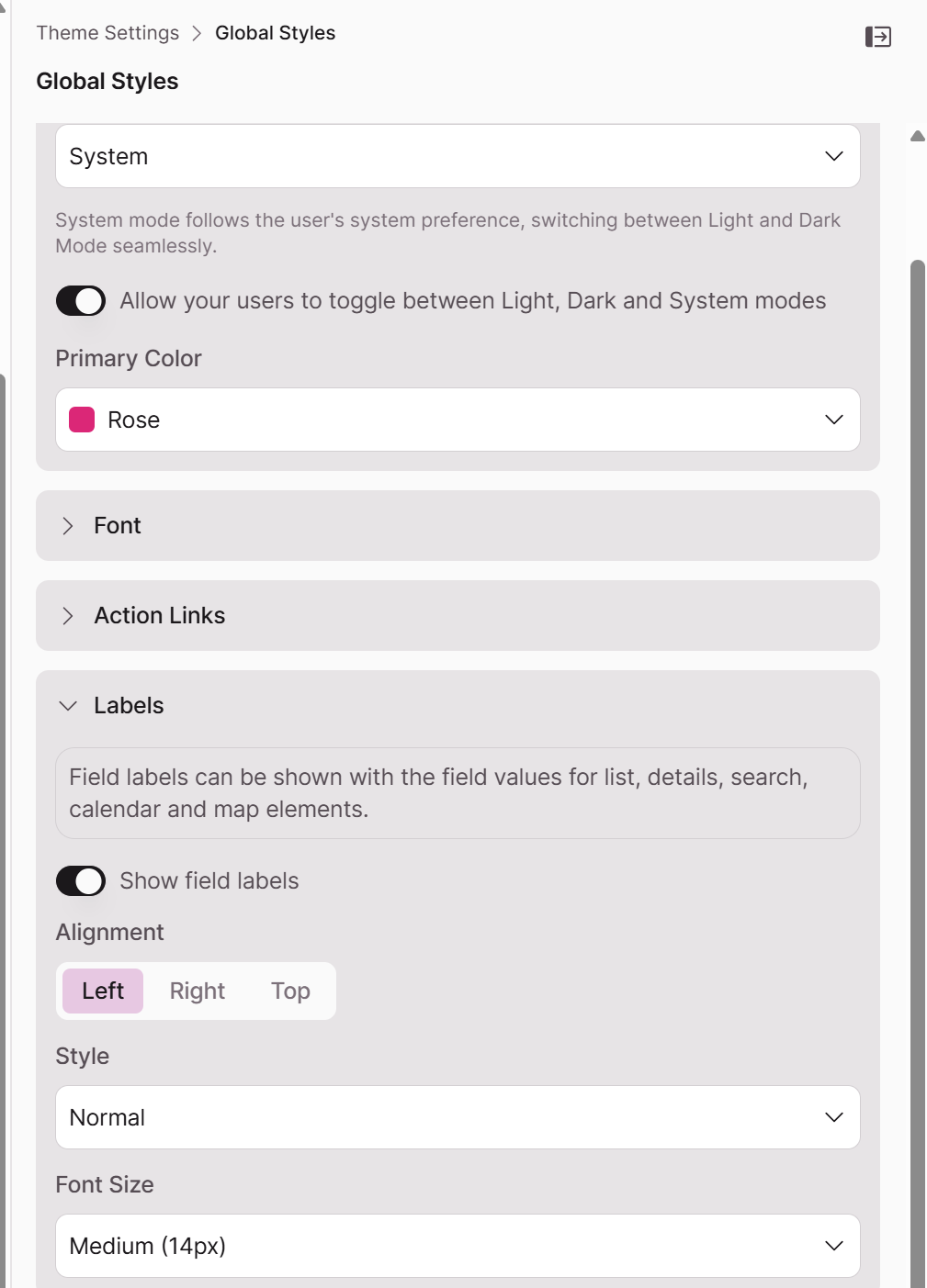
- Navigate to Themes → Global Styles
- Locate the Labels section
- Customize the following properties:
Toggle Labels on or off. When on:
Alignment
- Left
- Center
- Right
Style
- Regular
- Bold
- Semi-Bold
- Italic
Font Size
- Choose from available size options to establish visual hierarchy
- Click Save
Note: Label customizations apply globally to all views that display labels.
Best Practices
Action Links
- Filled Buttons – Use for the most important action you want users to take, such as "Submit" or "Add Record"
- Outline Buttons – Use for supporting actions like "View Details" or "Cancel"
- Links – Use for less prominent actions or when you prefer a cleaner, minimal interface
Labels
- Alignment – Left-align for traditional forms; center-align for modern, streamlined layouts
- Bold styling – Creates clear visual separation between field names and values
- Font size – Establish hierarchy with larger labels for section headers and smaller labels for individual fields
Legacy Action Links
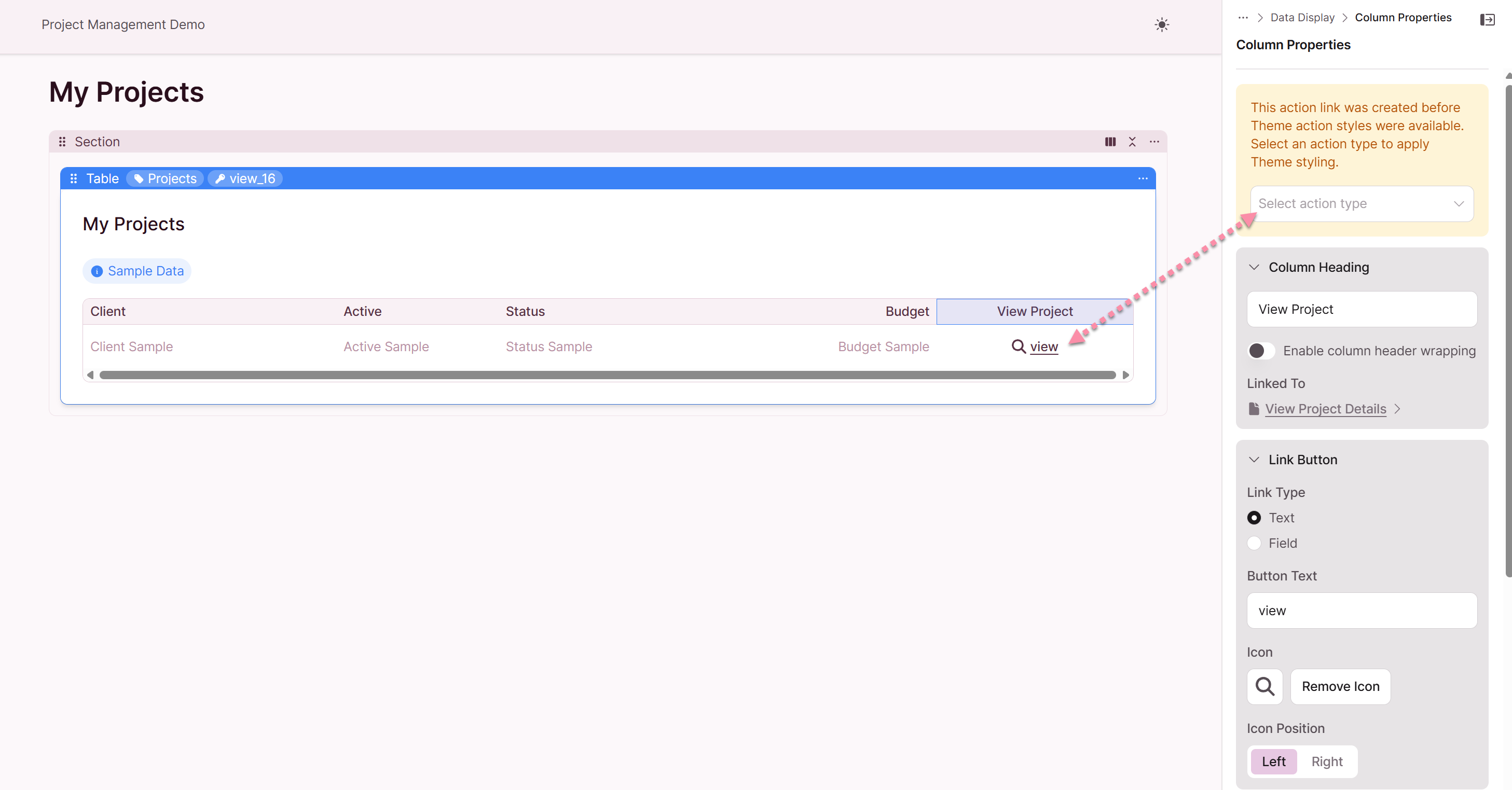
What is changing with action links?
The styling for action links has been updated to provide a more modern and consistent look and feel across your applications. This update affects both existing and newly created action links.
How will my existing action links look after the update?
Your existing view and edit action links may be slightly updated, and you will have the option to select which type of action link style you'd like applied to it.
| Existing Link Style | Action Type | Appearance without Theme Default Set | Appearance with Theme Default Set |
|---|---|---|---|
| Icon Only | View, Edit | Icon remains, no outline | Original icon with theme style applied |
| Icon & Text | View, Edit | Icon and underlined text | Original icon with theme style applied |
| Text Only | View, Edit | Underlined text | Theme style applied |
| Icon Only | Link | Icon remains, no outline | Icon with theme style applied |
| Icon & Text | Link | Icon and underlined text | Original icon with theme style applied |
| Text Only | Link | Underlined text | Link theme style applied |
| Icon Only | Delete | Icon remains, no outline | Original icon with theme style applied |
| Icon & Text | Delete | Icon and underlined text | Original icon with theme style applied |
| Text Only | Delete | Underlined text | Theme style applied |
Do I have old styling for my existing links?
For "View" and "Edit" action links, you will see a legacy notice and can choose which link type is applicable. If you have set up custom styling in Themes, the action link styling will be updated. Existing icons will not change.
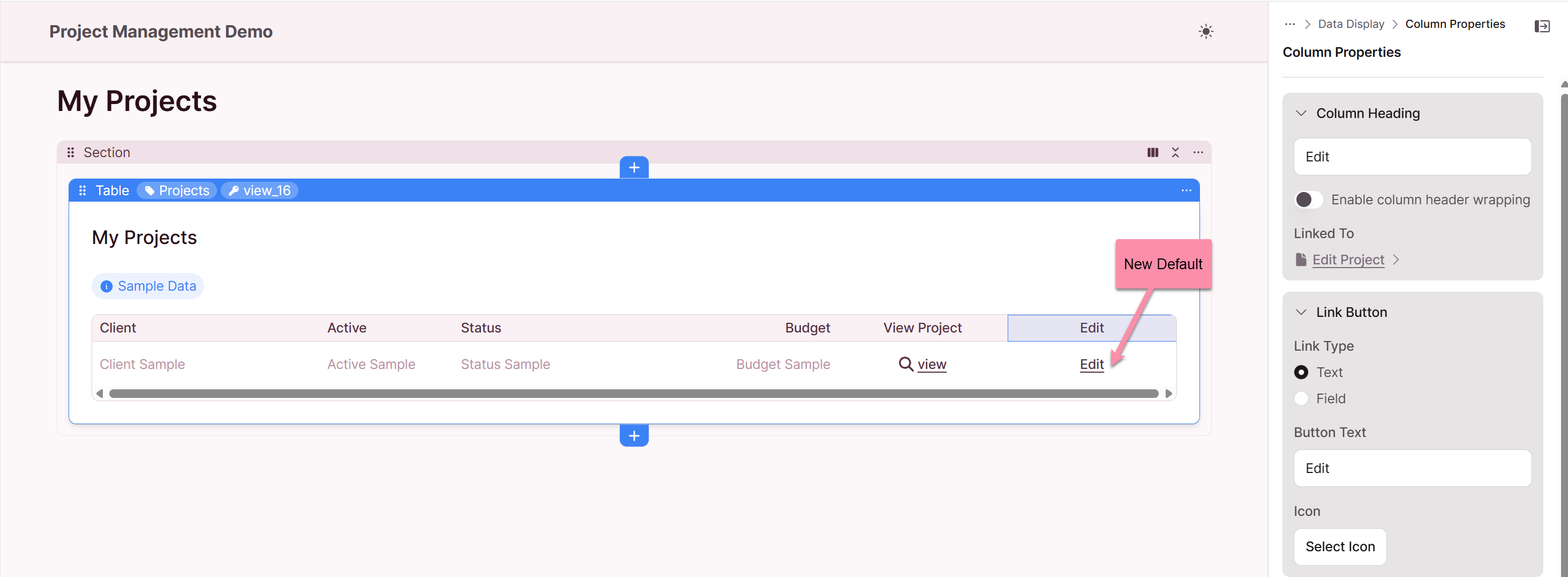
What do the new action links look like by default?
If you have not customized your themes, all new action links that you create (including "View", "Edit", and "Delete") will appear as underlined text by default.
How can I customize the appearance of my action links?
You can customize the appearance of your action links by configuring your app Themes. Navigation to Themes: Global Settings: Action Links. When you have a theme configured, your action links will adopt the styles you have defined, such as button styles, colors, and icons.

What are "Page Links" and "Dynamic Actions" and how are they styled?
"Page Links" and "Dynamic Actions" types of links that have customized styling. By default, they appear as underlined text with 2-line header wrapping. When you have a theme configured, they will adopt your custom theme styles.
Summary of Action Link Styling
The following table provides a high-level summary of the action link styling:
| Scenario | Styling | Notes |
|---|---|---|
| Existing Links | Varies based on original style and theme | For legacy links, select the applicable link type |
| New Links (No Theme) | Underlined text | This is the new default for all action links |
| New Links (With Theme) | Custom styles | Links will adopt your defined theme styles |
We hope this guide helps you understand the new action link styling.